

Bringing martial arts online with a simple experience that encourages action.
Black Belt Taekwondo needed a modern website that reflected the strength and discipline of its in-person training. The original site was outdated, cluttered, and hard to navigate, especially on mobile. This redesign aimed to create a clean, responsive experience. It made it easy for users to learn about programs, book a trial, and get in touch, which ultimately boosted engagement and conversions.
The original Black Belt Taekwondo website lacked visual clarity, mobile responsiveness, and clear navigation. Important actions like booking a trial or finding class information were hard to find, which caused high drop-off rates. The old design did not show the school’s professionalism or meet the needs of growing users, especially mobile visitors. A redesign was necessary to update the experience and increase conversions.
The website was the school’s only digital channel for sharing program information and contact details. It was not optimized for mobile, lacked tool integrations, and was updated manually by the owner. With various users, including parents, new visitors, and current students, the site needed to improve support for discovery, engagement, and lead conversion on different devices.

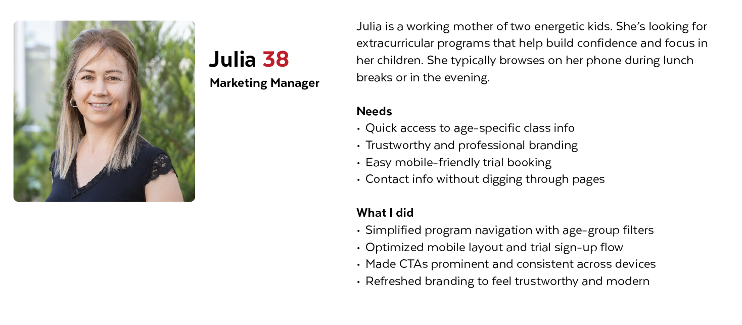
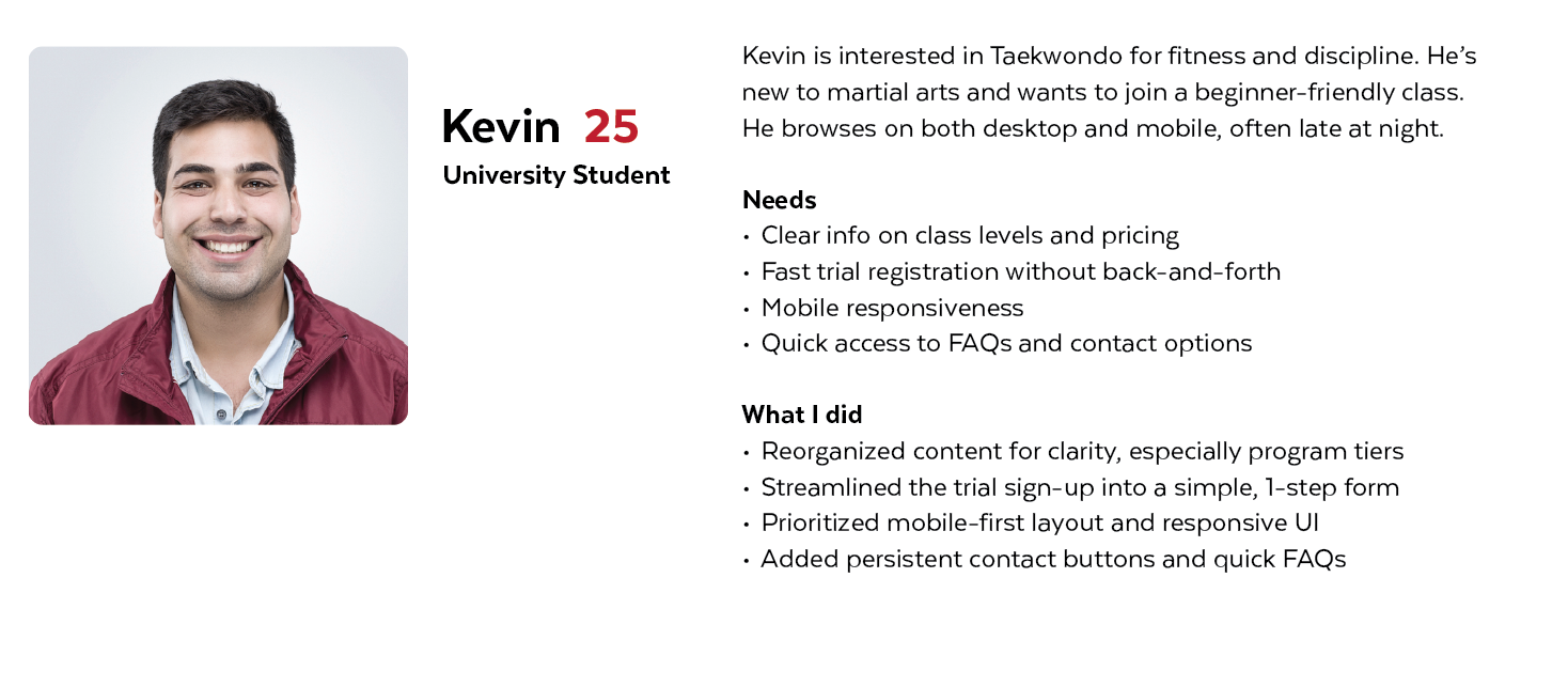
To create an experience that really met user needs, I identified two main personas: prospective parents looking for classes for their children and new students eager to join. These personas guided decisions about clear content, mobile usability, and easy trial booking.
To better understand the needs and frustrations of real users, I conducted informal interviews and usability reviews with parents and adult students who had visited the website before. I also looked at user behavior by observing and gathering feedback from the business owner. This helped uncover important usability issues, especially regarding the mobile experience, unclear class structure, and the difficulty in taking actions like booking a trial or finding contact information.

Parents struggled to find class information for kids and book trials on her phone. The site felt outdated, disorganized, and untrustworthy.

New adult students had trouble finding beginner classes and clear pricing. The homepage was confusing. The trial sign-up didn’t send a confirmation, and the contact details were hard to find.

Couldn’t quickly find class options by age group
Website looked unprofessional, which affected trust
Trial booking was hidden and hard to complete on mobile
Had to pinch and zoom to read content on her phone
Navigation was cluttered and confusing

Homepage overwhelmed him with too much text and no clear flow
Couldn’t tell which classes were beginner-friendly
No intro offer to guide decision
Contact info was not easily accessible
Trial sign-up felt outdated and lacked confirmation
To resolve the main problems and update the user experience, I introduced several focused design improvements:
Reorganized the site’s structure. Added clear sections for age-based programs.
Applied mobile-first design with easy-to-read text, large buttons, and a clear hierarchy.
Added clear, consistent CTAs like “Book a Trial” on every important screen.
Reduced friction in the booking process by using a simpler form and having fewer steps.
Introduced a clean homepage layout that emphasized class levels and trial options.
Included clear pricing from the start to help with decision-making.
Streamlined navigation and added sticky contact options on each page.
Optimized the desktop and mobile versions for clarity and speed.
The original site was cluttered, hard to navigate, and not mobile-friendly. This caused users to leave before taking action. The redesign introduced a clean, responsive layout with clear CTAs and simpler content. Now, it is easier for users like Julia and Kevin to find what they need and take the next step.
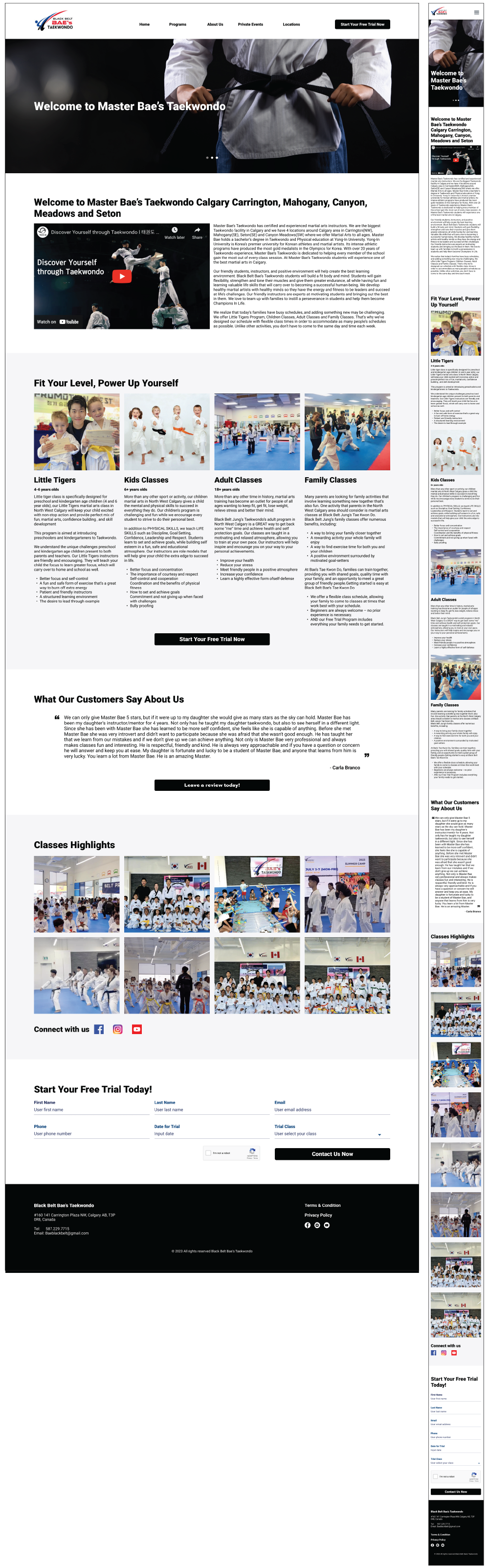
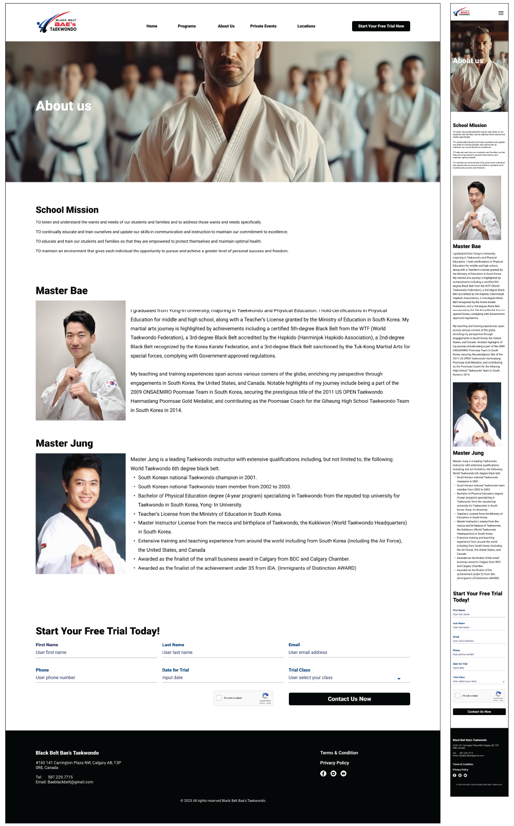
Desktop - Before & After
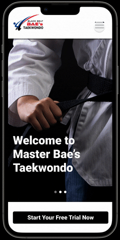
Mobile - Before & After


The project started with a request to clean up the site. A closer look showed more serious usability and conversion issues. Instead of just making small changes, I examined the whole structure, content, and mobile performance. This resulted in a complete redesign strategy focused on improving clarity, accessibility, and lead generation, especially for first-time users.


Cluttered Layout: The content was packed tightly with little white space. This made the site look visually overwhelming.
No clear visual hierarchy: Important elements such as CTAs and program information got lost in long paragraphs and uneven formatting.
Mobile Unfriendly: Users needed to pinch and zoom to read content. The layout broke on smaller screens.
Hard-to-Find Trial Booking: The sign-up button was hidden in subpages, making it necessary to click multiple times.
Unstructured Program Info: Class details did not separate by age or experience level. This made it confusing for new visitors.
The design seemed old-fashioned: This made users less trusting and did not show the professionalism of the school.
Manual Updates: The owner made all content changes by hand. This led to delays and inconsistencies.
Poor Navigation: Menus were confusing and packed with options, making it hard for users to find important pages quickly.
To quickly explore layout ideas and check the structure early, I made simple sketches. I focused on making navigation easier, clarifying class offerings, and highlighting important CTAs. These initial concepts helped create a mobile-first experience that centered on user needs and cut down on visual clutter.
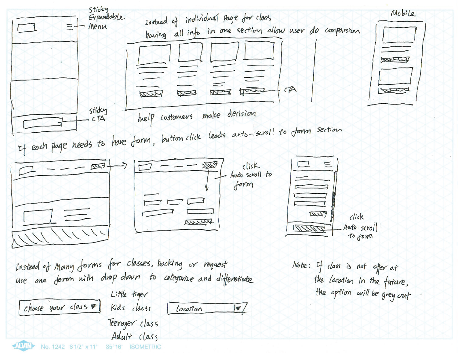
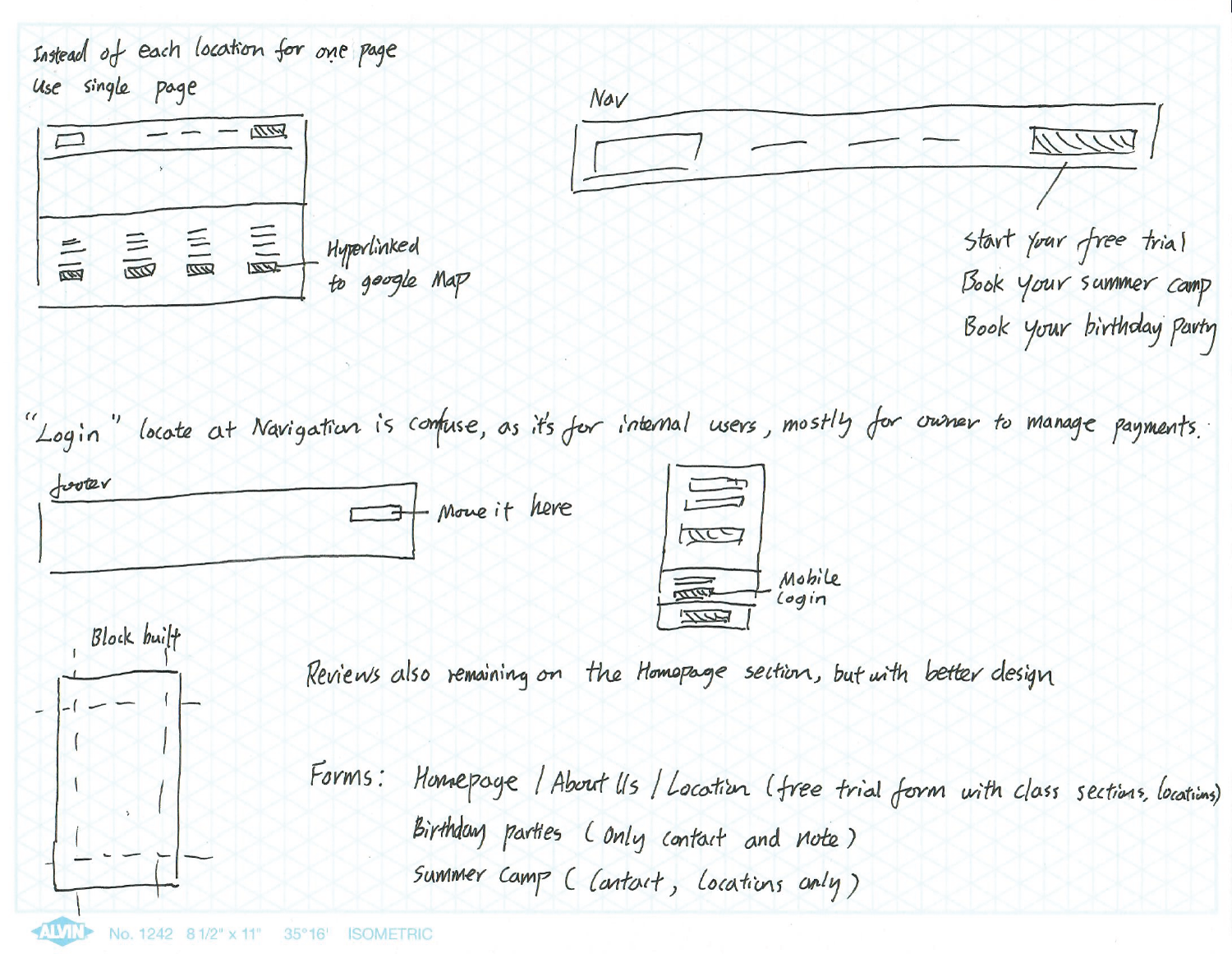
To resolve content confusion and improve navigation, I reorganized the site’s information architecture into straightforward, user-focused categories such as Programs by Age, About, Contact, and Book a Trial. This new structure reduced friction, supported intuitive browsing, and matched user goals. It made it easier to find relevant information and take action, especially on mobile.
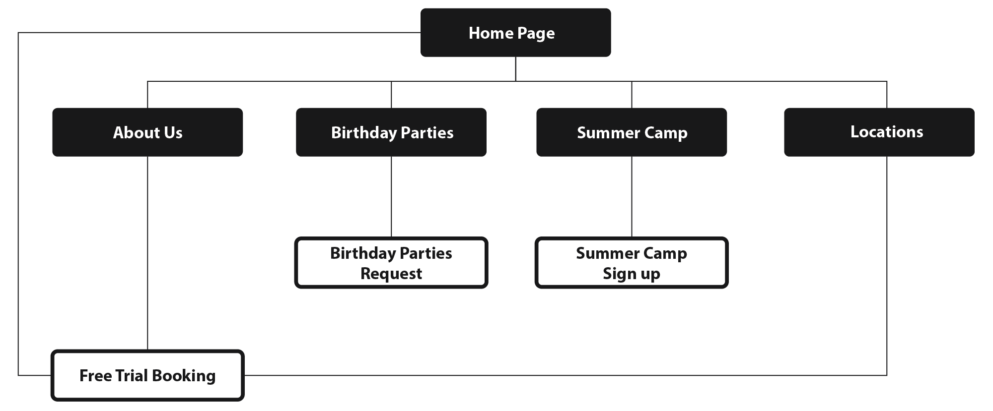
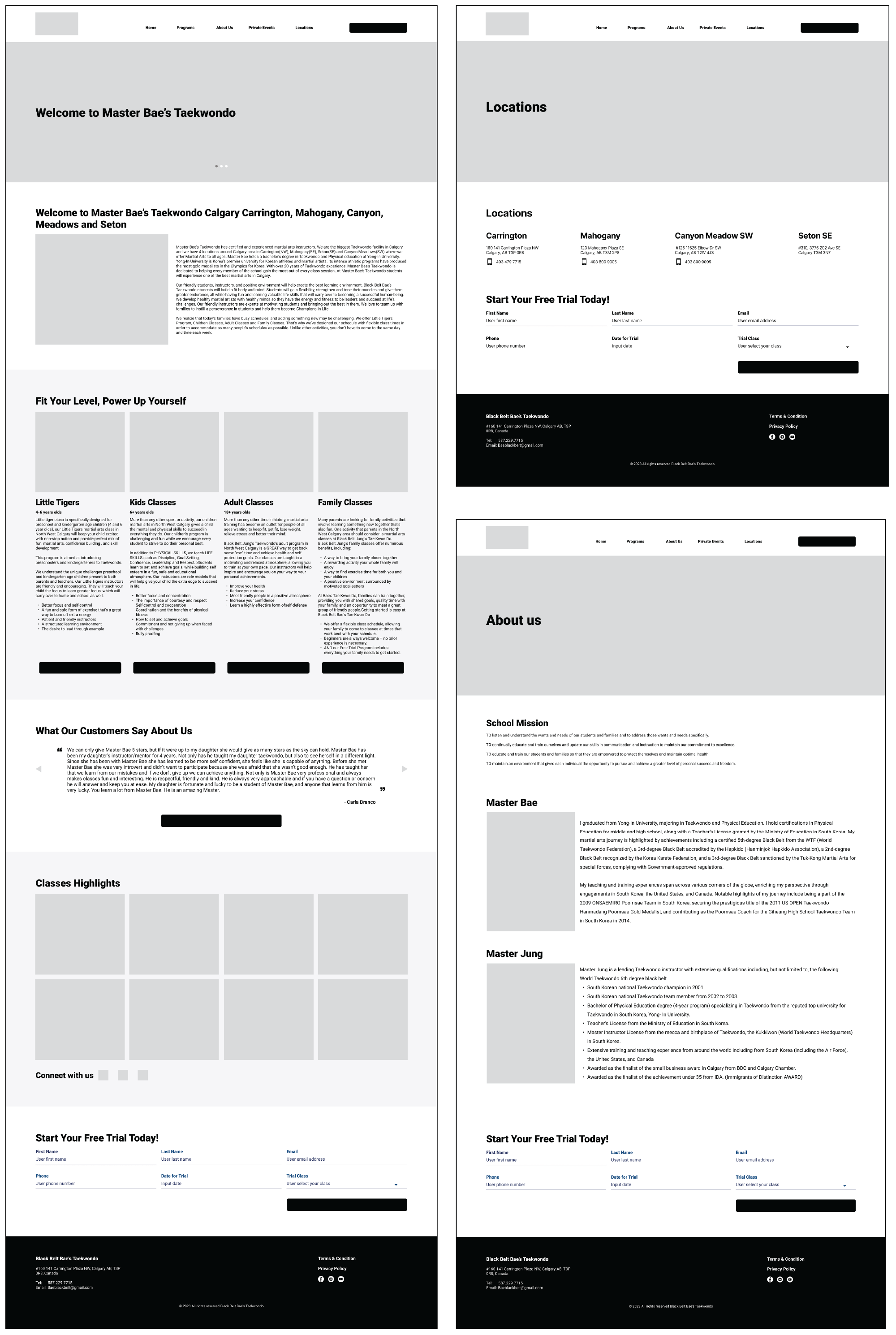
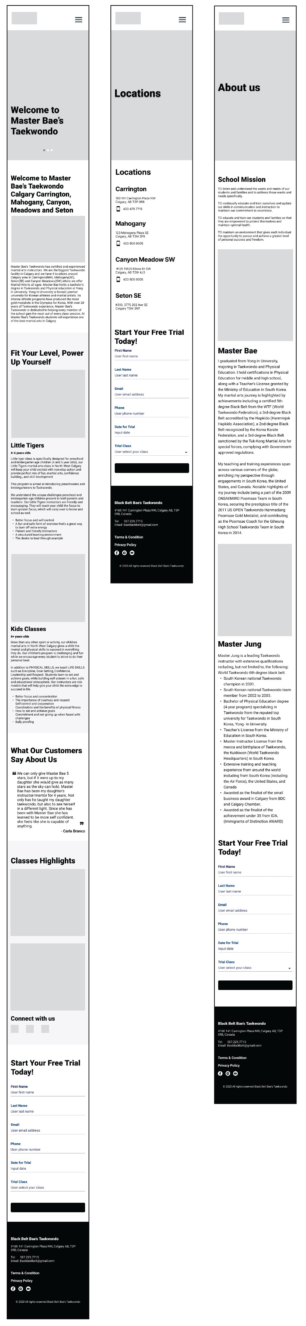
Based on the new information structure and low-fidelity sketches, I created mid-fidelity wireframes for both desktop and mobile. These wireframes emphasized content clarity, visual order, and simplified user paths. This was particularly important for key tasks such as exploring programs and booking a trial. The mobile wireframes focused on easy navigation, large tap areas, and scroll-friendly layouts to match real user behavior.
With the layout and structure approved, I created detailed mockups for both desktop and mobile. The new visual style used bold typography, striking images, and clear spacing to capture the school's energy and professionalism. Each screen was designed with accessibility and responsiveness in mind to make the experience smooth across devices. I also built an interactive prototype to show the improved flow from discovery to trial booking.
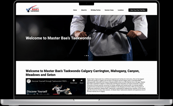
The final UI achieves clarity and visual impact on both desktop and mobile. I used bold headings, clean layouts, and consistent branding to build trust and energy. Key actions such as “Book a Trial” and “Contact Us” were made highly visible. Age-based program blocks helped users quickly find what they needed. I carefully optimized mobile screens with touch-friendly layouts, simplified menus, and scrollable content sections for an easy experience on the go.
The redesign led to noticeable improvements in user experience and business results within the first three months after launch:
42% increase in mobile trial bookings. A simpler sign-up form and clear calls to action improved mobile conversion rates.
30% reduction in bounce rate. Clear navigation and mobile-friendly pages kept users engaged longer.
2× increase in contact inquiries. Contact buttons and quick links made it easier for first-time visitors.
50% faster page load time. A cleaner codebase and responsive design improved performance on all devices.
Improved user feedback. Parents and students mentioned that the new site felt more professional, easier to use, and more trustworthy.
These changes not only increased engagement but also built the studio’s credibility. This helped the owner handle inquiries more efficiently and present the brand with more confidence.
This project showed how a clear, mobile-first redesign can dramatically improve user engagement and lead conversion—even for small businesses with limited tech resources. I learned the value of early feedback, and next time, I’d involve users sooner and recommend easier tools for site updates.