Reimagine Personal Banking

Enhance the personal banking experience through system thinking

Overview

A digital payment solution designed for a regional bank to modernize personal banking experiences. The product supports both mobile and non-mobile users by enabling secure, cardless ATM transactions and alternative digital payment methods. Built with accessibility, security, and user inclusivity at its core, the solution streamlines payment workflows for customers and support agents while ensuring compliance with industry standards.

Animated Gif

Current Situation

The bank's existing cash withdrawal system relies heavily on physical cards and in-person interactions, limiting accessibility for users with mobile devices who expect faster, more secure digital options. This dependency creates friction in everyday banking, particularly at ATMs, where mobile-first customers lack alternative ways to access their funds. Additionally, internal support teams face growing inefficiencies due to redundant workflows and fragmented systems.

Ecosystem

This solution brought together a complex network: mobile and non-mobile users, ATMs, the bank’s app and web platform, support agents, developers, and compliance teams. Each had a unique role, from enabling cardless withdrawals to ensuring security and seamless support. Our goal was to align this system behind one unified, intuitive user experience.

Persona

To guide our decisions, I created composite personas based on user research, usability findings, and internal team insights. One key persona emerged:

User Research

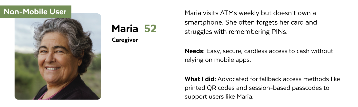
When I joined the project, I reviewed past decisions and conducted interviews with mobile and non-mobile users. I observed ATM uses data and spoke with support agents to uncover hidden pain points. This research revealed key themes that shaped our personas and guided the design toward accessibility, clarity, and trust.

Mobile-first users were frustrated by the continued need for physical cards.

Non-mobile users felt excluded from new digital workflows and overwhelmed by ATM complexity.

Understand the Pain points

Mobile-First Users

  1. No support for cardless ATM withdrawals

    Despite relying on their phone, users still needed a physical card to withdraw cash.

  2. Inconsistent app-to-ATM experience

    The mobile app didn’t integrate smoothly with ATM workflows, causing friction.

  3. Security concerns around mobile transactions

    Users worried about exposing sensitive info if the mobile flow wasn’t airtight.

Non-Mobile Users

  1. Dependency on physical cards

    If users forgets or loses their card, they have no alternative way to access funds.

  2. Confusing ATM workflows

    Cluttered screens and unclear steps make ATM use stressful, especially without digital assistance.

  3. Lack of secure fallback options

    One-size-fits-all security methods don’t work well for users without mobile devices.

Designed Solutions

Guided by user research and real-world pain points, I focused on designing solutions that balanced accessibility, security, and ease of use. Each solution targeted a specific user need that ensuring both mobile-first and non-mobile users could access their funds confidently and intuitively.

Prototype

Heading

How It Started

With research insights in hand, I led collaborative sessions to explore solutions from both technical and user perspectives. The goal was to generate ideas that balanced real-world constraints with user needs which focusing on accessibility, cardless access, and security.

Low-fi Sketches

I started with quick, low-fidelity sketches to explore different directions for cardless ATM access and simplified workflows. These rough ideas helped me validate core concepts early, prioritize key interactions, and get fast feedback from the team before moving into wireframes.

Wireframe

Building on the lo-fi sketches, I created mid-fidelity wireframes to map out the full experience. This included mobile authentication, ATM interaction, and fallback options for non-mobile users. The wireframes helped align layout, content hierarchy, and user flow across different scenarios.

User Flow

After validating the wireframes, I created detailed user flows to ensure clarity across all key actions, including withdrawing, depositing, and paying. These flows showed how users would move through each step, starting a transaction on the app and completing it at the ATM. For non-mobile users, the flows illustrated how they could access services using an NFC-enabled access card. This process also helped identify edge cases, security checkpoints, and backend dependencies early on.

Hi-fi Design

With the user flows defined, I translated them into high-fidelity designs to bring the experience to life. I focused on creating a clean, accessible interface that reflected the bank’s brand while ensuring clarity across mobile and ATM screens. For mobile users, I designed a secure and intuitive cardless flow. For non-mobile users, I integrated clear prompts for using the physical card tag. Each screen was refined through internal reviews and prepared for usability testing.

Design Details

Impact

Lorem ipsum dolor sit amet, consectetur adipiscing elit. Suspendisse varius enim in eros elementum tristique. Duis cursus, mi quis viverra ornare, eros dolor interdum nulla, ut commodo diam libero vitae erat. Aenean faucibus nibh et justo cursus id rutrum lorem imperdiet. Nunc ut sem vitae risus tristique posuere.

Takeaways

The Starting Point - User Research

One of the biggest gaps was end-user research. Until then, designs were driven by assumptions which shaped more by stakeholder opinions and designer bias than real user needs. To shift that, we talked to both mobile-first users and those who still rely on cash, observing how they interact with ATM systems and mobile banking. What we uncovered brought clarity: patterns, pain points, and unmet needs that had been invisible until we asked.

User Interviews

We interviewed a mix of participants across varying age groups and banking behaviors:

  • 3 mobile-first users (ages 25–40)

  • 3 traditional users (ages 45–65)

Key Themes Identified:

  • Convenience vs. Limitations: Mobile-first users appreciate the speed of wallet-based payments but feel frustrated when physical cards are still required for large withdrawals.

  • Security Perception: Traditional users view physical cards and cash as more secure and remain hesitant about mobile withdrawals and digital authentication.

  • Device Dependence: Users expressed concern over forgetting passcodes or running out of battery during mobile-based ATM use.

  • Expectations of ATM Interactions: Most users have a strong mental model of how ATM workflows should proceed and expect confirmation steps, clear feedback, and receipt options.

Usability Testing

We also developed a low-fidelity prototype simulating the mobile-initiated ATM withdrawal process. Users were asked to complete the following flow:

  1. Select a bank card from their mobile device.

  2. Tap the device on the NFC-enabled area of the ATM.

  3. Authenticate using a passcode or biometric.

  4. Enter and confirm the withdrawal amount.

  5. Complete the transaction and retrieve cash.

Test Scenarios Included:

  • Biometric failure and retry.

  • Attempted withdrawal above the default limit.

  • Low battery notification during session.

  • Delay or inactivity timeouts at the ATM.

Observations and Insights

Mobile Payment Convenience & Limitations

Observations:

  • Users find mobile payments highly convenient and prefer storing multiple cards in digital wallets.

  • Most users can complete routine purchases quickly and efficiently without needing to carry physical cards.

  • Frustration arises when transactions exceed default limits, requiring a physical card to proceed.

  • Users rely on seamless, uninterrupted digital experiences and view fallback to physical cards as a step backward.

Insights:

  • There is a strong opportunity to implement alternative verification methods (e.g., biometric confirmation, in-app passcodes) to maintain the digital flow for high-value transactions.

  • Users value the autonomy and flexibility of mobile payments and expect consistency across all purchase scenarios.

  • Enhancing mobile security while preserving convenience could boost user trust and reduce friction during edge cases.

Preference for Traditional Payment Methods

Observations:

  • Some users, especially those less digitally inclined, continue to rely heavily on cash and physical cards.

  • These users perceive cash as more secure and tangible, especially for budget control and daily expenses.

  • Hesitancy toward mobile payments stems from concerns about fraud, technical failure, and lack of familiarity with digital platforms.

Insights:

  • Digital adoption strategies must address security concerns, provide guided experiences, and deliver step-by-step onboarding for traditional users.

  • The design should accommodate both digital and traditional behaviors, offering parallel, accessible experiences that build trust over time.

  • Encouraging adoption requires not only technology but also clear education, reassurance, and simplicity in execution.

Pain Points and User Behavior

With real user insights in hand, the team began to question the assumptions behind earlier design decisions. The belief that a mobile-first approach would naturally lead traditional users to adopt digital payments didn’t hold up. Research showed us what we had missed user habits, accessibility gaps, and very different expectations. It was a turning point that grounded the project in reality, not just optimism.

Mobile-First Users:

  • Frustration when physical card is required for transactions over the mobile payment limit.

  • Interrupted experience due to lack of alternative digital authentication methods.

  • Dependency on mobile device battery and connectivity for access to banking functions.

  • Lack of trust signals during high-value mobile transactions.

Traditional Users:

  • Discomfort with mobile wallets due to unfamiliarity or fear of digital fraud.

  • Reluctance to transition from cash and physical cards, which feel more secure.

  • Anxiety over forgotten passcodes or biometric setup failures.

  • Limited understanding of how mobile tap-to-withdraw or digital banking flows work.

Unlocking What Users Actually Need

Secure Passcode Verification for High-Value Transactions

  • Mobile-first users love the ease of tapping to pay—until a purchase goes over the default limit.

  • That’s when the smooth experience breaks, and they’re forced to reach for a physical card they might not have.

  • To fix that, we introduced a simple idea: let users verify high-value transactions by entering the same passcode they set up at their bank.

  • No extra steps, no new logins—just a secure fallback that fits into their existing habits.

  • It keeps the flow seamless, the payment secure, and the card right where it was: left at home.

Cardless ATM Transactions via Mobile Tap

  • For mobile-first users, needing a physical card just to use an ATM feels like a step backward.

  • So we imagined a simpler way, what if you could just tap your phone at the ATM, the same way you pay at checkout?

  • With NFC-enabled authentication, users can securely verify their identity using their device and passcode which no card required.

  • From there, withdrawing or depositing cash becomes just as seamless as a contactless payment.

  • It’s one more way to make everyday banking meet users where they already are—on their phones.

Simplified ATM Access for Traditional Cash Users

  • Some users still trust cash and physical cards and that’s okay.

  • But even for them, inserting a card into an ATM feels a little outdated (and not always secure).

  • With tap-to-ATM, they can simply tap their card, enter a passcode, and get on with their transaction with no slot, no swipe.

  • It’s faster, reduces card wear, and helps prevent skimming, all while keeping the flow familiar.

  • It’s a quiet upgrade that respects old habits while making room for something better.

Impacts:

More seamless and accessible for mobile-first users

More secure and frictionless for both digital and traditional customers

More efficient and user-friendly, reducing dependency on physical cards while maintaining security

Mapping User Journeys

To understand two very different kinds of users, those who tap to pay and those who still carry cash, we mapped out their journeys from start to finish. Each step revealed not just actions but frustrations, emotions, and missed opportunities. While some teams rush into design, we took the time to see the full picture. That’s how we built a solution that works for everyone, not just the digitally fluent.

Making purchase

Cash withdraw

Working Behind the Scenes

Note: Due to NDA restrictions, certain sections of the development service blueprint and process flow have been removed from the images to protect confidential information.

One of the first things I pushed for was a service blueprint. It helped us see what users do not see, how design, development, and product teams work together behind the scenes. By mapping internal operations, system triggers, and dependencies, we uncovered gaps that were slowing everything down. It gave the dev team clarity, aligned cross-functional efforts, and turned a scattered process into a shared and scalable workflow.

Let's Go with Flows

Note: Due to NDA restrictions, certain sections of the development service blueprint and process flow have been removed from the images to protect confidential information.

Rather than relying on imagined flows from earlier meetings, we built entirely new user flows and status flows grounded in real user needs. The user flows helped us trace every step, from mobile payments to ATM withdrawals, uncovering friction points and opportunities to simplify. The status flows revealed how the system processes and communicates each transaction, which is especially important for security checks and real-time limits. Together, they closed the gap between front-end experience and back-end logic, making the entire journey clear, consistent, and secure.

Application Status Flow

Application User Flow

Design Begins with Structure

To respect the organization’s privacy, the original information architecture remains behind the scenes. Instead, we focused on highlighting the new structures built for this innovation sections that introduced payment verification, tap-to-ATM access, and a cleaner status flow. By mapping only the redesigned components, we kept things confidential while showing how each piece fits into the larger system. The result is a structure that feels intuitive to users and scalable for the team behind it.

Information Architecuture

Low-Fidelity Wireframe

🔗 Low-Fidelity Wireframe

We started wireframing with the organization’s low-fidelity Figma library as our guide, giving the team a consistent and accessible foundation to build from. Using predefined components helped us move faster, stay visually aligned, and keep every screen rooted in the brand’s existing standards. It also made handoff easier and reduced guesswork across design and development. These wireframes became the blueprint for integrating new features like payment verification, tap-to-ATM access, and stronger security flows—fitting seamlessly into the app while keeping the experience clear and intuitive.

A Seamless Standard

The design team was fortunate to work with a system already built with accessibility in mind. Every UI component in the Figma library was thoughtfully crafted, tested, and ready to meet WCAG standards—making accessibility part of the process, not an afterthought. From buttons to form fields, everything was set up for keyboard navigation, screen readers, and clear visual contrast. With those components, we brought the high-fidelity wireframes to life, confident that the final experience would be both inclusive and easy to use.

High-Fidelity Wireframe

🔗 High-Fidelity Wireframe

Connecting the Dots Between Design and Dev

While we were refining the experience, the dev team had their hands full too. To make cardless ATM withdrawals even more secure, they added biometric authentication right into the mobile app. Now, instead of reaching for a card, users can tap and verify with a fingerprint which quick, simple, and secure. It’s one more way we’re reducing risk and making everyday banking feel effortless.

Seamless & Secure Cardless ATM Withdrawal Process

  1. Initiating the Transaction - Users open the banking application or digital wallet on their mobile device.They navigate to their linked bank card or credit card and select the withdraw cash option. At the ATM, they tap their mobile device on the designated area (NFC-enabled) to initiate authentication.

  2. Biometric or Passcode Authentication for Security - Once the mobile device is tapped, a confirmation screen appears on the app.Users are prompted to authenticate using biometric verification (such as fingerprint or facial recognition) or enter their secure bank passcode to authorize access. After successful authentication, users enter the cash amount they wish to withdraw.

  3. Confirming & Completing the Withdrawal - Users review and confirm the withdrawal request.The ATM dispenses the cash, and users have the option to manually complete the transaction within the app. For added security, the system includes an automatic logout feature—if no action is taken within 30 seconds of inactivity, the session will auto-close, ensuring user privacy and security.

Prototyping the Future

Prototyping takes time, but it’s the clearest way to bring ideas to life. To test and refine the cardless ATM withdrawal flow, we built interactive prototypes that walked through every step from selecting a card to tapping the ATM and confirming with biometrics. These helped stakeholders, testers, and developers experience the journey in real time, including edge cases and micro-interactions. It became our shared blueprint, making sure the final experience was smooth, secure, and ready to build.

🔗 High-Fidelity Prototype - Flow 1: Cash Withdrawn | Flow 2: Mobile Card Payment | Flow 3: Failed to add card

Usability Testing

To validate the cardless ATM flow, we watched real users try it for themselves—tapping, authenticating, and withdrawing cash with just their phones. We didn’t just look for success; we paid close attention to where things went wrong. Simulated errors like failed biometrics or exceeded limits helped us see how users reacted, recovered, and navigated the flow. Those moments of confusion became opportunities to fine-tune the interface, improve guidance, and make the entire experience feel simple, secure, and stress-free.

Lessons Learned and Moving Forward

With the workflows, research, and designs fully documented and handed off, my role on this project comes to a close. The handoff was smooth, shaped by tight collaboration, clear communication, and constant testing along the way. One thing this project reinforced is that good design goes beyond the screen—it’s about system thinking, alignment, and questioning assumptions early. While I’ve stepped away, the work lives on in a solution that’s inclusive, secure, and ready to support every kind of user.

This project reminded me that innovation is not just about technology. It is about understanding real human needs and designing for them with clarity and care. By bridging the gap between mobile-first users and traditional customers, we created a more inclusive, secure, and frictionless way to bank. The result was not only a better product, but also a stronger sense of trust between users and their everyday banking experience.