
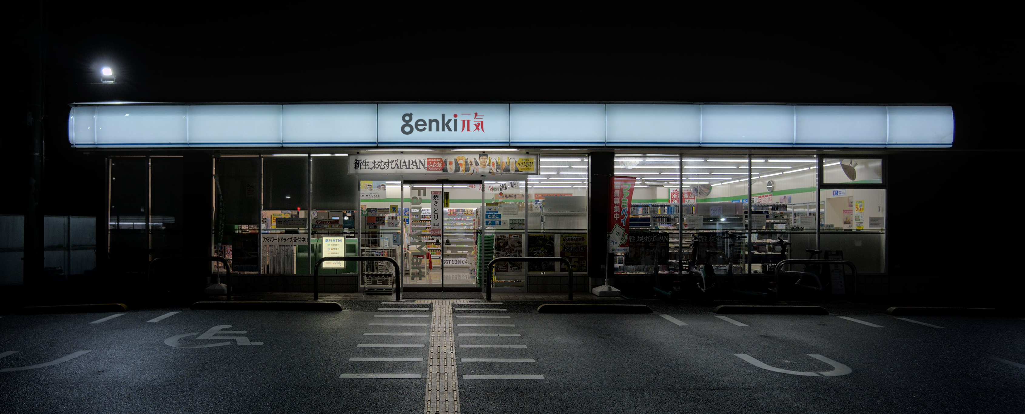

The core business idea of Genki元氣 is to assist people who are now entering our 40s and have experienced the huge transition from old technology to modern AI with coming to terms with the emotions associated with regret. We imagined this as an immersive e-commerce site that operates like a traditional shop looked after by a seasoned elder in a Miyazaki-style fantasy world. Each item on the platform is individually selected by the owner and acts as a "time capsule" intended to restore the "original life energy" which is lost every day.
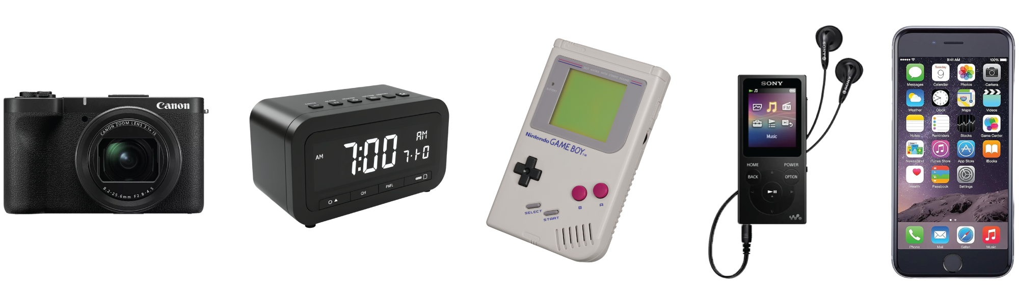
Having reached our 40s as people who used to dream and enjoy science fiction, we have seen a huge and immediate transition from writing letters by hand and using landlines to sending messages instantly via AI and making video calls. Although we accept these new developments, we still tend to feel a quiet, wistful yearning for our past memories and our childhoods.
The goal was to set up a digital retreat which functions as a kind of modern "fantasy shop". It is an immersive online experience in which each and every product is personally selected by the owner. These items serve as "time capsules" and are chosen with the aim of healing and restoring the original life energy (Ki) of our friends. The brand had to convey this duality visually: through a contemporary and highly practical digital platform that evokes strong, meaningful emotions together with the provision of carefully chosen physical products.
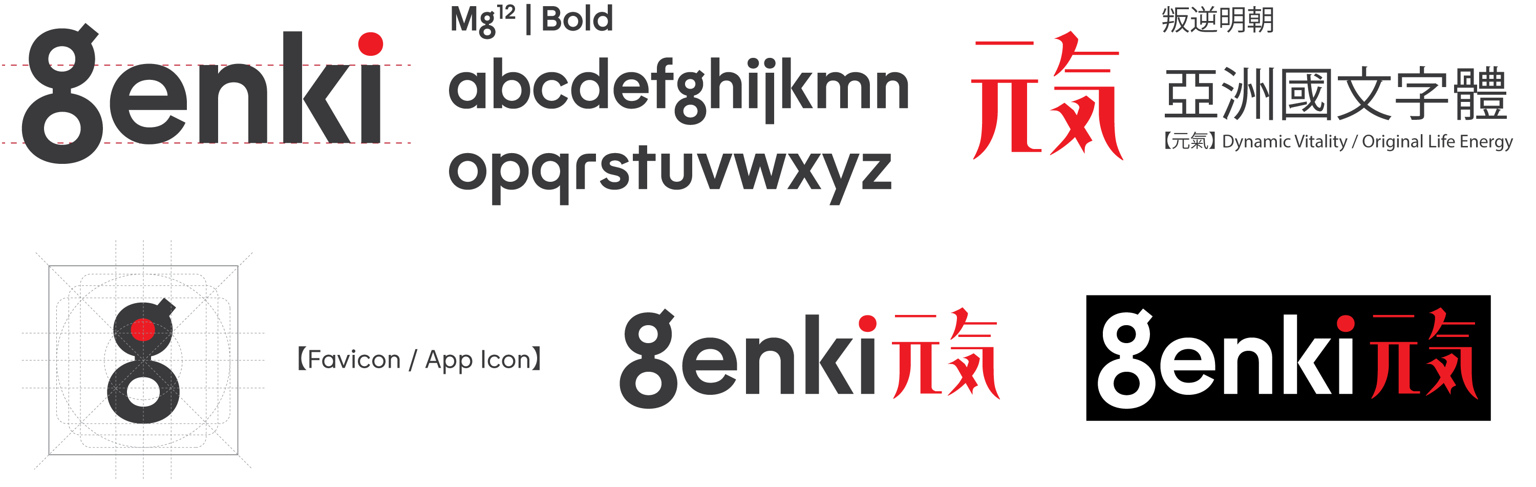
The Genki元氣 logo is a dual system, embodying our fundamental brand tension: Modern Technology vs. Traditional Vitality.
Modern Precision (genki): The geometric, sans-serif logo stands as a symbol of efficiency, logic, and structure and reflects the precision characteristic of the technological world in which we now operate, thereby ensuring that the e-commerce platform is user-friendly.
Visual Vitality (元気): The red calligraphic characters are lively and vigorous, with a literal meaning of "Original Life Energy", and this mark continues to be the most prominent feature of the system, serving as the main visual metaphor for healing, the spirit, and life.
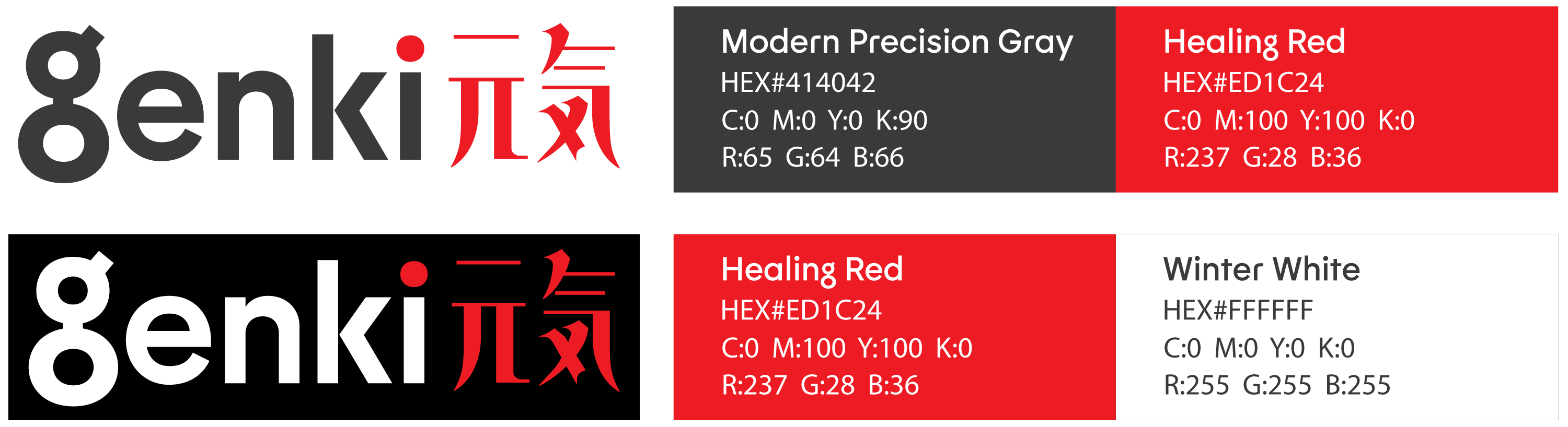
The colour system is directly based on the logo's DNA and has been optimised for mastery of digital interfaces and for the display of products.
Dark Gray (#414042) is used for the functional structure of the interface, for the main text content, and for accurate filter controls since it guarantees functional clarity and readability.
Healing Red (#ED1C24) should be used exclusively for transactional UI elements; by reserving this bright colour for 'Replenish' call-of-action buttons and for highlighting important wellness aspects, it promotes conversions while symbolising the refilling of life energy.
Winter White (#FFFFFF) for high-contrast typography, primary interface backgrounds, and essential negative space. It represents the clean, modern digital canvas of the e-commerce platform.
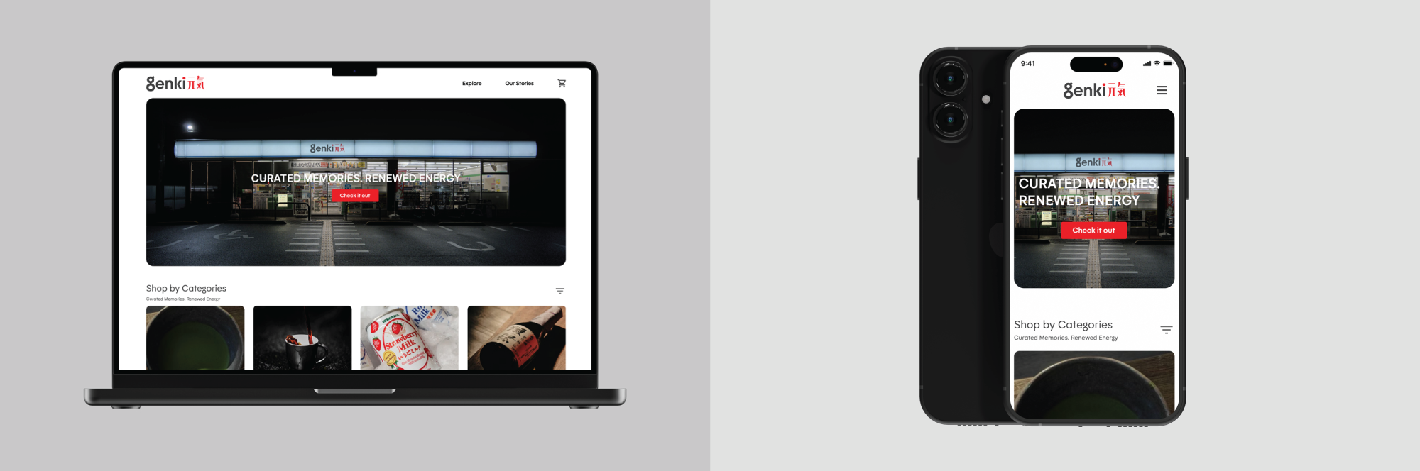
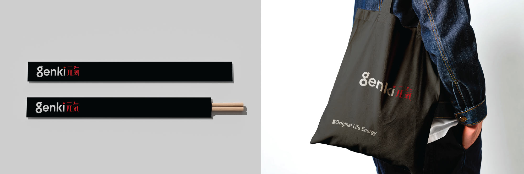
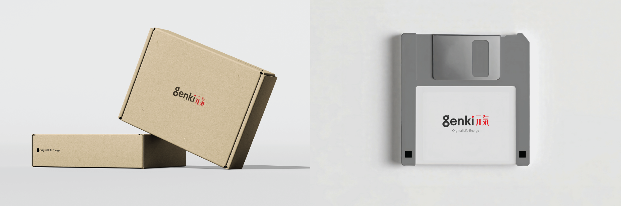
We created a dual-brand experience which connects digital exploration with tactile satisfaction, making the user's journey seem consistent from the very first click until the final unboxing.
The Digital Fantasy Store
The Explore Screen carefully designed by the Owner in order to demonstrate expertise in interface design and complex data structures is intended to enhance the merchandise. Since each product has been personally chosen by the founder, they are displayed on warm "Time Neutral" cards so as to highlight their special, individual value when set against a sketched fantasy store background. The correct data hierarchy is kept using strict gray filter controls, and the red call-to-action buttons prompt the user to restore their vitality.
Time Capsule Fulfillment
The physical packaging serves as the last opportunity to convey the brand's story. The packaging used for fulfilment incorporates tactile materials printed with vivid red Genki designs, making sure that the emotional impact and care involved in unboxing the product are identical to those experienced when the owner curates it.