
Improve accessibility, streamline navigation, and boost lead conversion through research-driven, WCAG-compliant design.
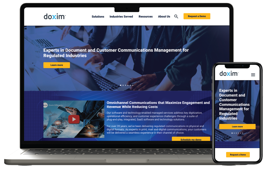
Doxim is a customer communications platform for banks and credit unions. I led improvements in UX and UI on the marketing website to improve accessibility, mobile usability, and lead conversion.
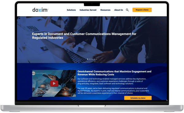

Doxim’s website was disjointed due to years of updates and acquisitions. Accessibility problems, uneven design, and limited mobile usability made it difficult for users to navigate or convert. Internally, teams did not have a clear system for keeping brand consistency and improving important user flows.
The marketing website was part of a larger system that included email campaigns, gated content, CRM integrations, and client portals. Each touchpoint needed to match visually and functionally to support a smooth user experience from awareness to conversion while meeting strict accessibility and compliance standards.

Before making design choices, I needed to know who we were designing for. I conducted user surveys, spoke with stakeholders, and reviewed website analytics. This work revealed two main user types, each with their own goals, frustrations, and accessibility needs. These personas provided a foundation of empathy and influenced every design decision from then on.
To find out where the website was lacking, I conducted user surveys, talked to stakeholders, and performed a basic accessibility audit. I also reviewed session recordings and heatmaps to pinpoint issues in key user flows. These findings helped me grasp both internal challenges and external user frustrations, forming the basis for focused improvements.

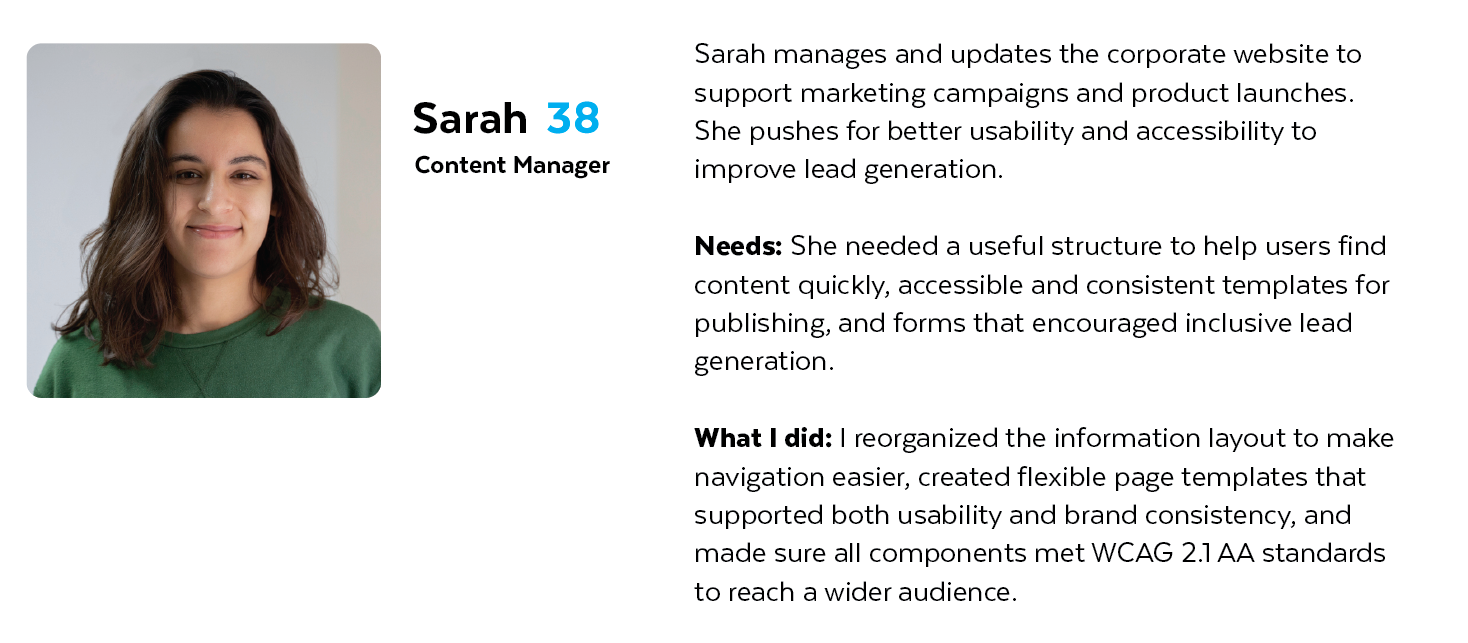
Sarah found the website hard to manage due to a cluttered structure, inconsistent templates, and limited accessibility support—making it difficult to maintain brand consistency or reach a wider audience.

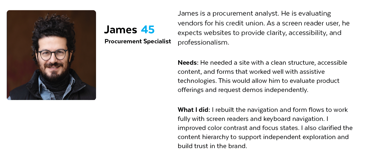
James experienced barriers with screen reader navigation, unlabeled forms, and poor contrast, preventing him from accessing content independently and confidently evaluating the company.

Found the site’s navigation confusing and hard to update
Lacked flexible, brand-consistent templates for publishing
Struggled with forms and content that didn’t meet accessibility standards
Felt the site wasn’t supporting marketing or lead generation effectively

Couldn’t navigate the site easily with a screen reader
Encountered unlabeled form fields and missing alt text
Struggled with low contrast and poor keyboard accessibility
Lost trust in the company’s digital and accessibility standards
I understood user frustrations and focused on practical, scalable solutions that tackled both internal workflow issues and external user access. Each design choice aimed to improve clarity, consistency, and inclusivity. This made the website easier to manage, navigate, and trust.
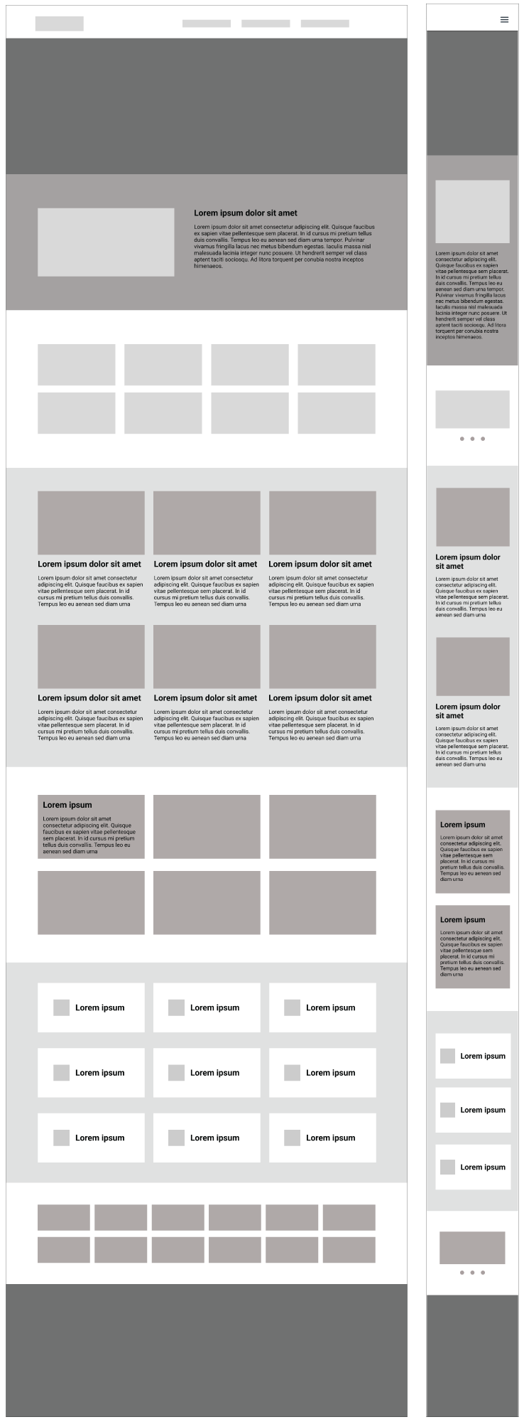
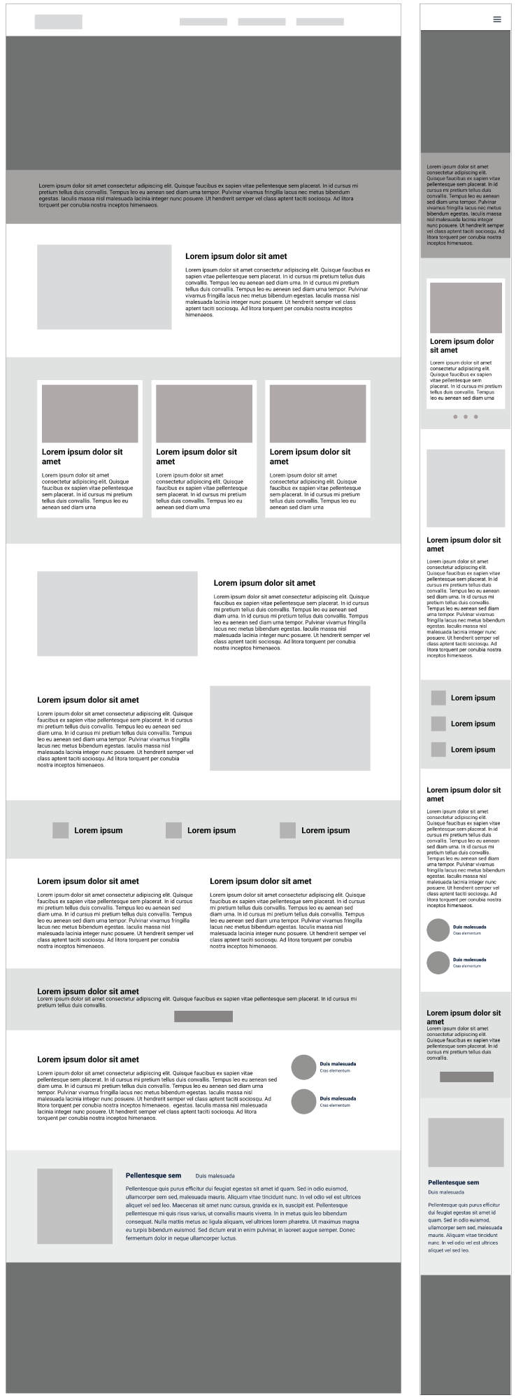
To support flexible marketing needs and make updates easier, I designed a library of pre-built content modules, similar to a website builder. These sections allowed internal teams to quickly put together pages without losing brand consistency or accessibility. This approach empowered non-technical users and reduced design debt over time.
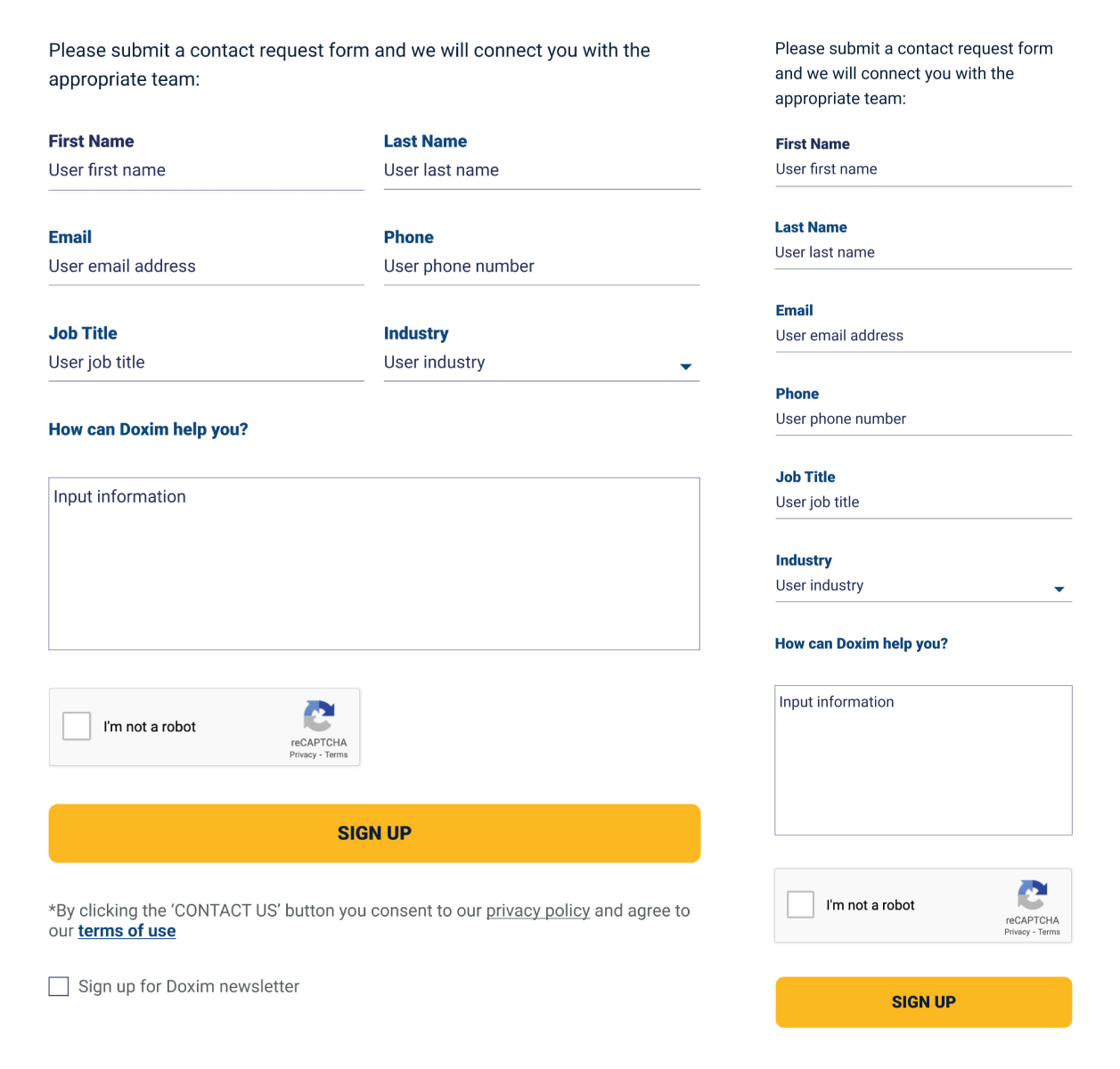
I rebuilt key forms and call-to-action areas with a clear hierarchy, proper labels, and strong contrast. I tested all form fields for screen reader compatibility and keyboard navigation. These improvements made conversion points more accessible and trustworthy for all users, including those using assistive technologies.
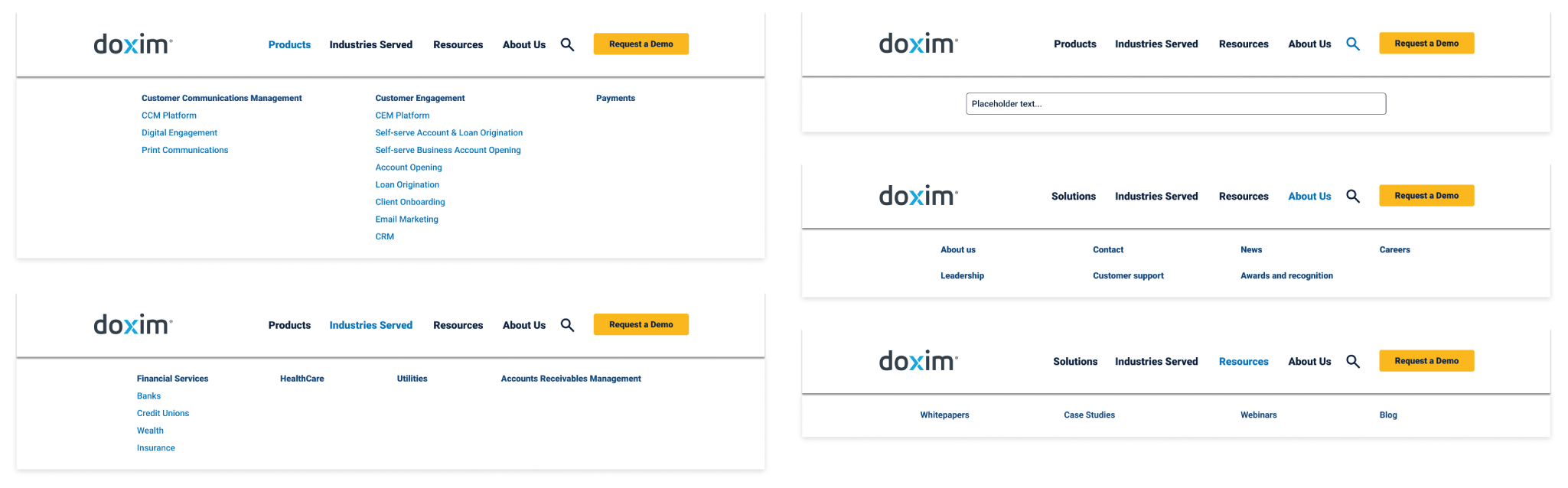
To reduce user friction and improve discoverability, I reorganized the site’s navigation based on actual usage data and feedback from stakeholders. I introduced a cleaner menu structure, consistent page layouts, and clearer pathways to core actions like requesting demos or accessing resources, resulting in a more intuitive experience for both first-time visitors and returning users.
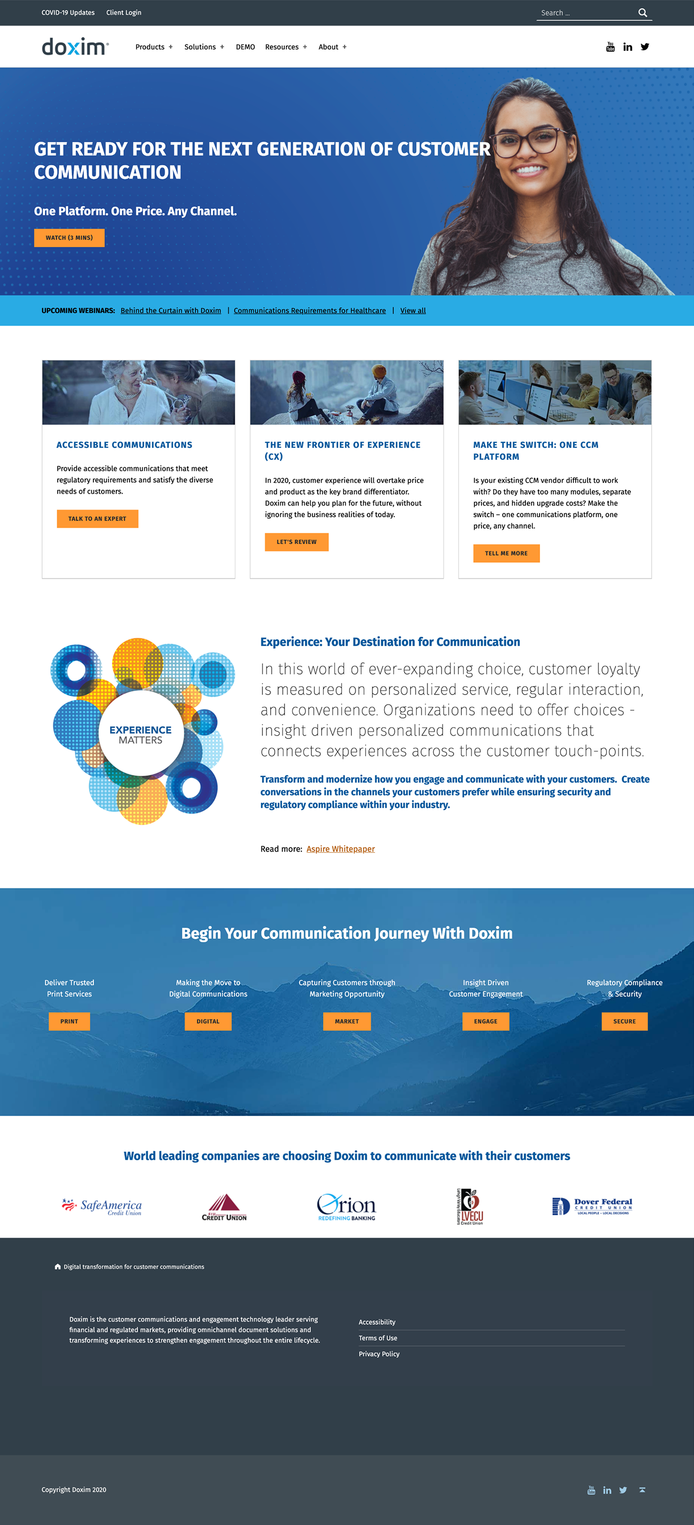
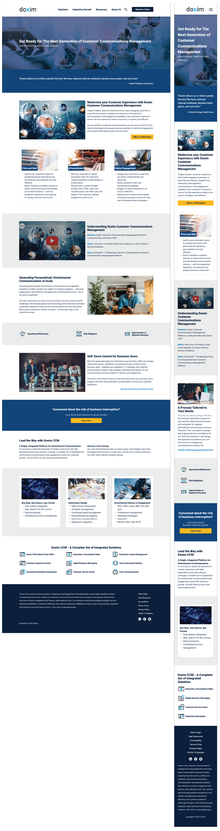
This project started as a request to update Doxim’s old website. However, it soon became clear that the issues went beyond just how it looked. The site’s structure, accessibility, and overall usability were hindering its effectiveness as a marketing tool. Before diving into design, I paused to identify the main problems, connect with key stakeholders, and reshape the project focusing on clarity, inclusivity, and lead conversion.
Overwhelming visual hierarchy. Competing font sizes, image blocks, and CTAs made it hard to focus on a clear path forward.
Unclear navigation structure. The top-level menu had too many dropdown options without clear grouping. This led to cognitive overload.
Weak CTA differentiation. Buttons like “Talk to an Expert,” “Let’s Review,” and “Tell Me More” did not clearly show what users were committing to.
Inaccessible color contrast. Light text over blue backgrounds in several areas failed basic WCAG contrast guidelines.
Non-responsive layout elements. Some visual blocks seemed fixed or crowded, indicating poor mobile adaptability.
Redundant messaging. Repetitive phrases like “communication journey” and “customer communication” diluted impact and caused confusion.
No clear value proposition. The content above the fold did not clearly explain what Doxim offers or how it's different from competitors.
Footer content overload. The footer had too much content with minimal hierarchy, making important links harder to find.
No visual cues for user roles. There were no clear pathways for different user types, such as prospects, existing clients, and job seekers.
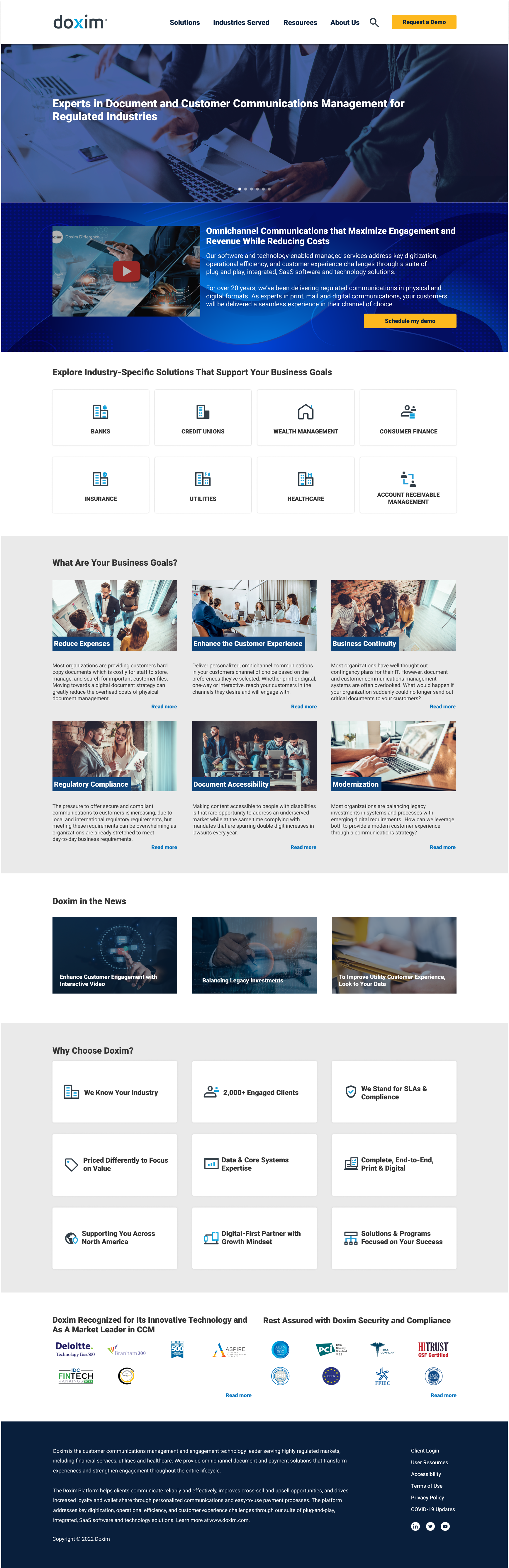
Heavy text blocks with poor scannability: Long paragraphs lacked visual breaks and clear headings. This made it difficult for users to quickly find key information.
Weak visual hierarchy: Multiple content sections received the same treatment, causing important details like product value and differentiators to get lost.
Overuse of buzzwords: Phrases like “One-Stop-Shop” and “Future-Proof” appeared too often without providing clear value to the reader.
Low contrast in feature grid: The white text on bright blue backgrounds may not meet WCAG contrast guidelines, especially for smaller font sizes.
No clear path to conversion: CTAs were scattered and lacked a coherent narrative or guided experience toward booking a demo or contacting sales.
Before moving into wireframe design, I explored rough layouts to see the content hierarchy, user flow, and key interactions. One important decision at this stage was to support a more flexible content strategy, similar to a website builder model. The team wanted to offer pre-built section modules that could adjust to different content needs, like those in WordPress. These sketches helped us test ideas early and get on the same page about reusable patterns that would simplify content creation for internal teams.
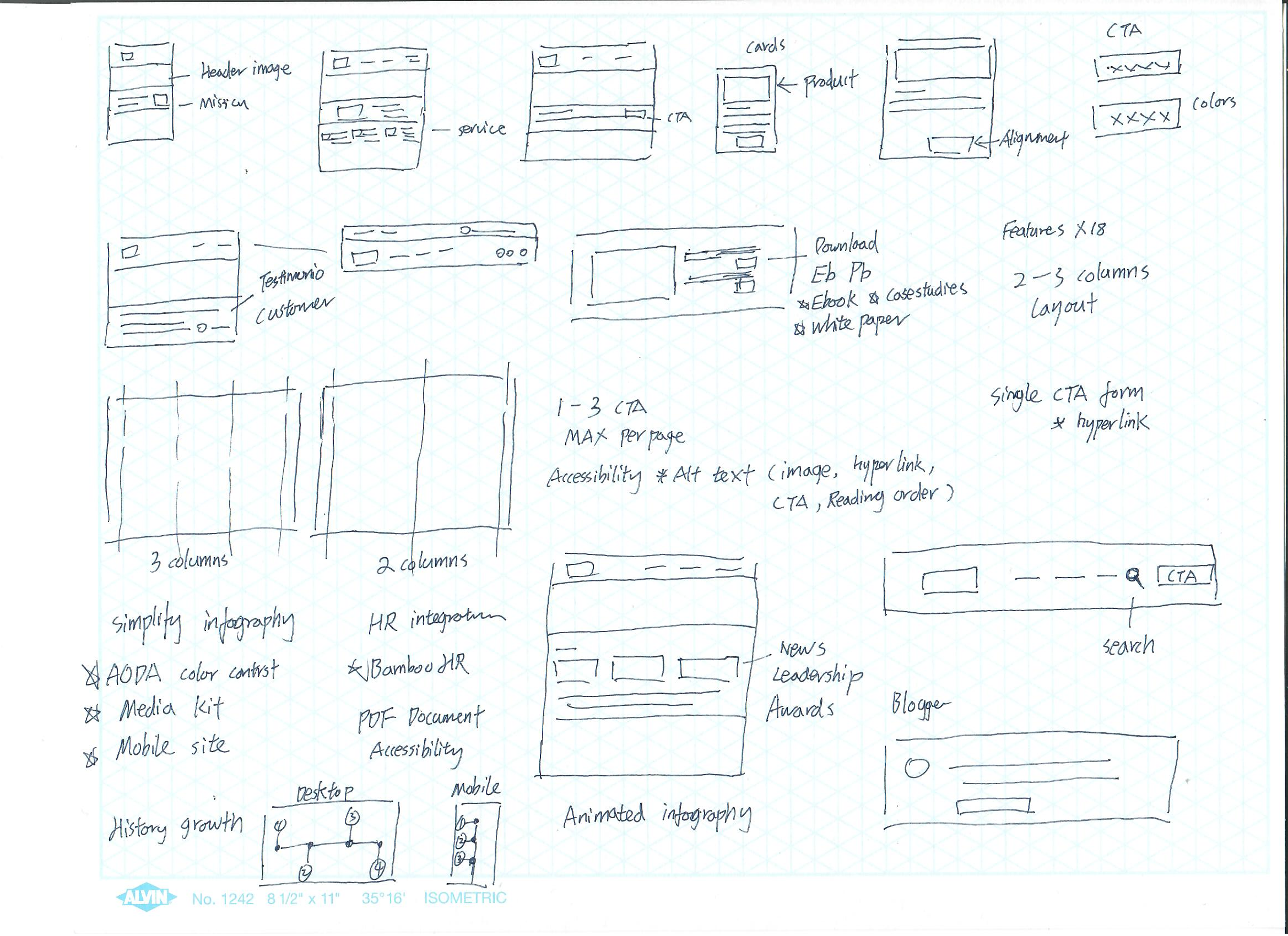
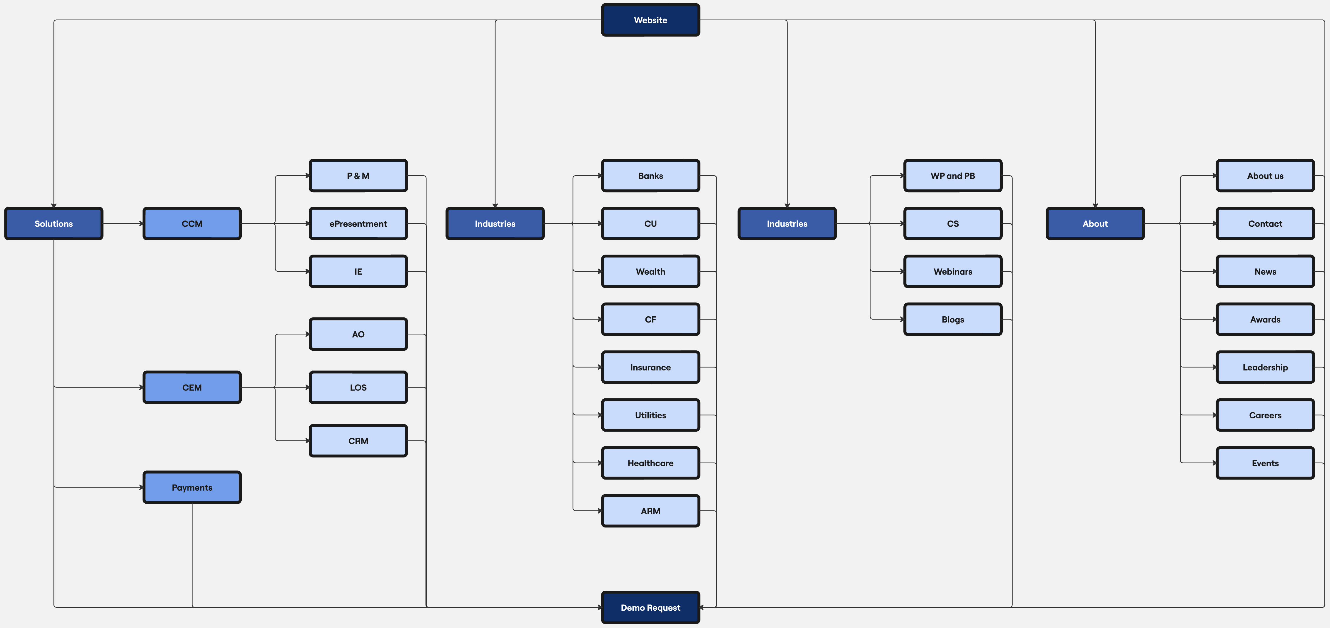
As we restructured the site, I created a new information layout to make it simpler and easier to find things. This helped connect navigation with actual user goals and supported better content management.
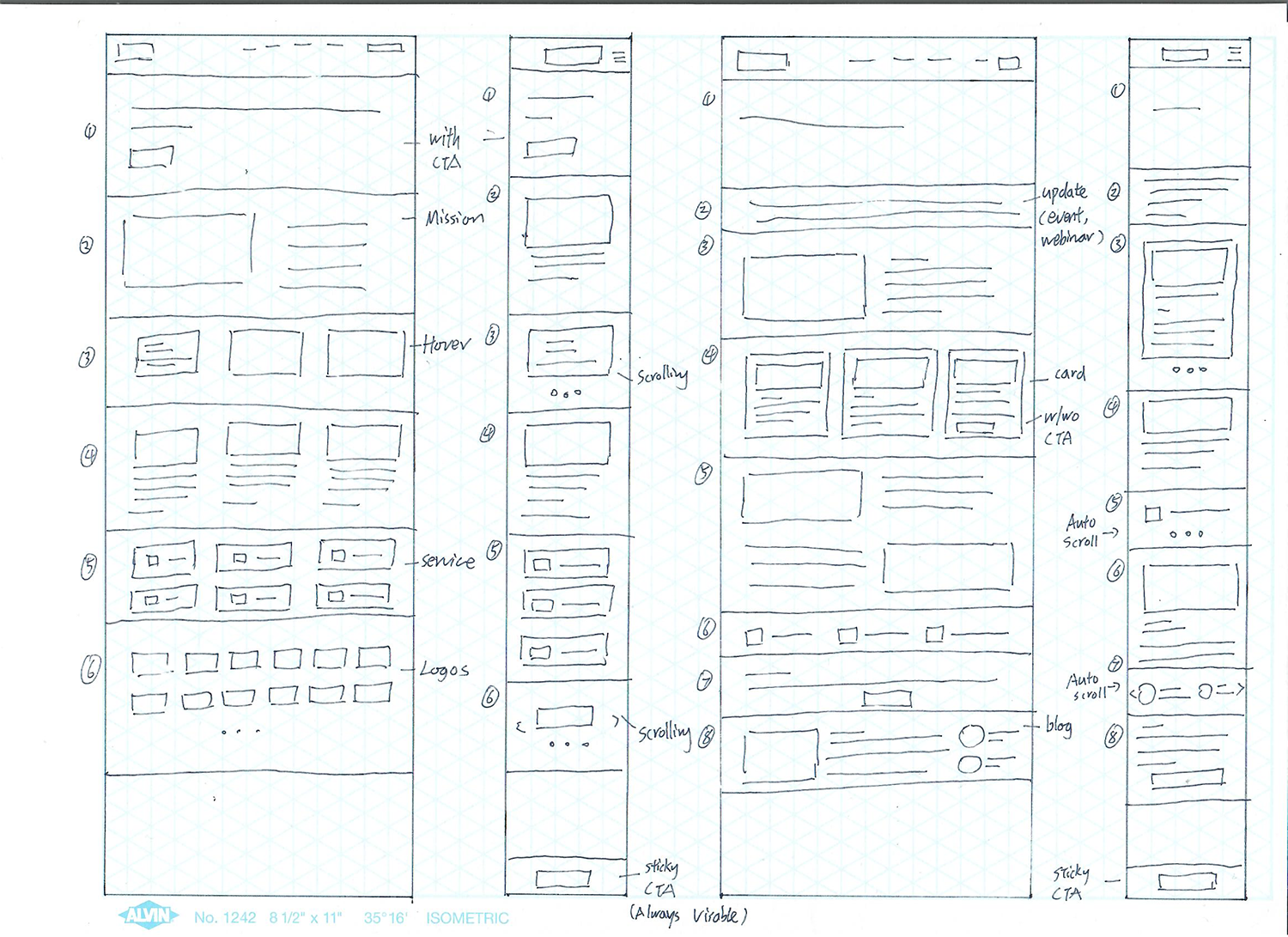
Using the low-fidelity sketches, I made mid-fidelity wireframes to outline page layouts, content structure, and interactive features. This step helped stakeholders look at functionality and flow without the distraction of visual design. It allowed us to agree on important improvements before starting the high-fidelity design.
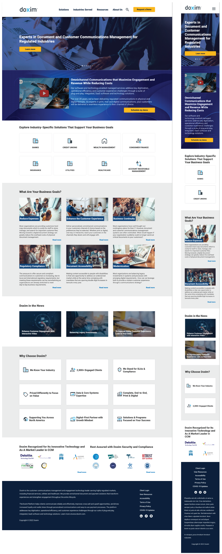
With the structure and flow confirmed, I started the high-fidelity design. I brought the interface to life using refined typography, color, and layout. Each element was created within a flexible design system to guarantee consistency, accessibility, and easy maintenance across pages and templates.
Beyond visual polish, this stage focused on making sure every component worked well. This included accessible forms, contrast-compliant buttons, and flexible layouts that adjusted to different screen sizes. I carefully considered spacing, alignment, and interaction cues to create a system that felt intuitive, inclusive, and easy to maintain.
The redesigned website improved usability and performance. Bounce rates on key product pages dropped by 18% in the first three months. Lead form completions increased by 17% due to simpler layouts and easier interactions. The new design also passed an internal accessibility audit, meeting WCAG 2.1 AA standards for all components. The marketing team reported faster content updates and more consistent branding across over 100 pages.
This project showed the importance of designing for both end users and internal teams. I witnessed how accessibility builds trust, usability, and performance. If I were to do it again, I would include accessibility testing earlier and involve a broader group of users during validation. Small, informed changes made a significant impact.