
Stabilizing teams, documenting decisions, and architecting scalable public sector platforms.
When I joined the platform design team partway through the project, we were facing uncertainty typical of fast-paced public sector work. The tight deadlines meant we lacked historical design documentation or decision logs. This left the team relying on outdated high-fidelity wireframes without enough context about the product. After a sudden leadership change, I was appointed to lead the design team with two other designers. Our main goal was to stabilize the product's execution framework.
We encountered a common problem in large organizations. There was a disconnect between centralized program direction and the real needs of regional stakeholders. This gap often caused issues during design reviews, as early concepts had trouble merging top-down policy requirements with the practical needs of administration.
As the new Team Lead, I saw that creating isolated, reactive interfaces for one emergency program, like short-term wildfire or flood evacuation tracking, wouldn’t address the deeper systemic issues. To prevent repetitive rework and build a sustainable framework, I shifted our focus toward a Universal Adjudication and Proxy Infrastructure.
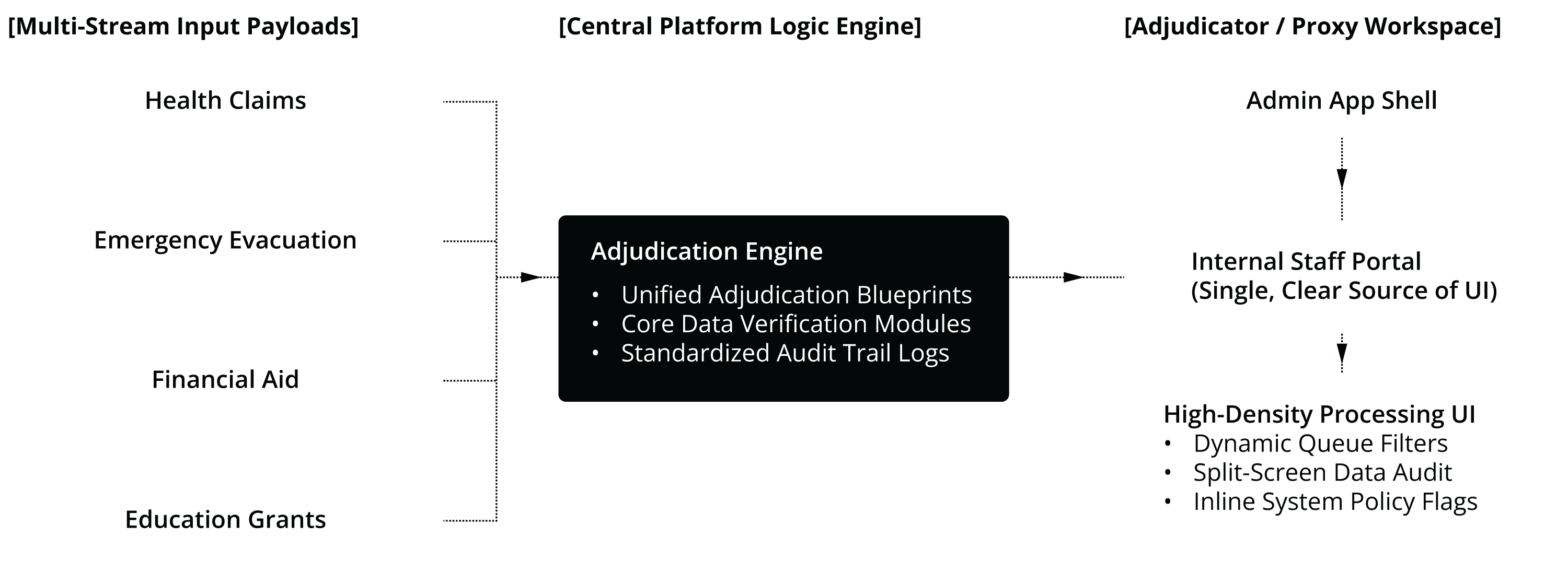
Multi-Stream Inputs: The platform is designed to take in secure applicant data from different government programs. This includes structured services like health claims and tuition grants, as well as urgent financial aid or crisis relief programs.
The Central Adjudication Core: Instead of making designers create new back-office layouts for each program, we defined the essential components of public benefit processing. Each benefit stream needs identity validation, a queue for verifying evidence, and a payment tracking log. By separating these repeatable parts, we built a strong layout engine using shared design elements. This provides consistent alert states, density ratios, and text styles throughout the platform.
The Operational Workspace: The final interface features a central administrative portal tailored for internal workers and proxies who handle files for citizens. The interface presents high-density data layouts, custom filters for mixed program queues, and a reliable visual audit trail. This helps internal staff perform high-volume verification quickly, accurately, and without the fatigue of switching contexts.
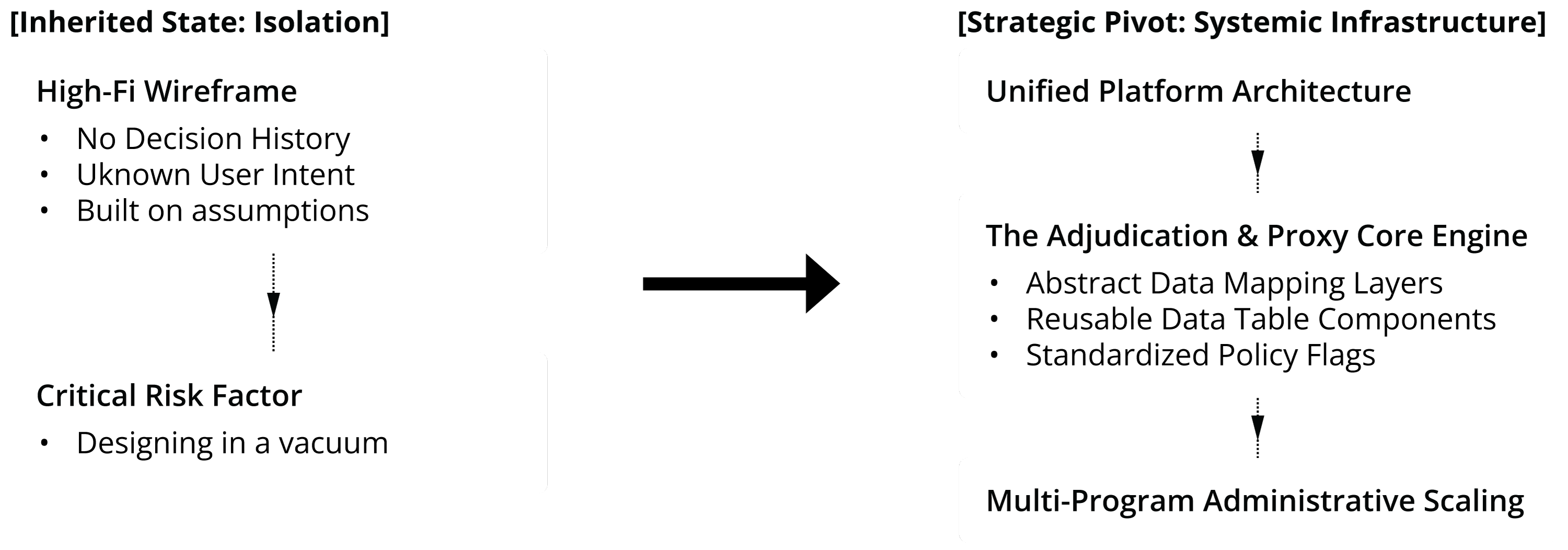
Inheriting a major public sector platform mid-stream often means dealing with legacy handoff issues. When our team took over the workspace, we found that the design logic was not recorded. Although there were high-fidelity visual mockups, the interaction models, policy constraints, and reasons behind them had not been officially documented.
Creating high-density enterprise tools for proxy workers in these circumstances carries significant delivery risk. Without a clear record of past product decisions, making quick UI changes can unintentionally breach backend legislative policies, disrupt complex processing workflows, or conflict with technical dependencies.
To reduce risks in the project, I changed the team’s approach from localized interface tweaks to creating a Universal Public Benefit Infrastructure. Rather than viewing the crisis evacuation workflow as a separate app, we looked at its main operational features from a platform design perspective.
On an administrative level, the basic processes for managing emergency aid—checking identity, auditing eligibility evidence, and tracking payout statuses—are similar to handling regular public services. By recognizing these common patterns, we shifted our focus from building a single emergency feature to developing a flexible, unified hub for staff.
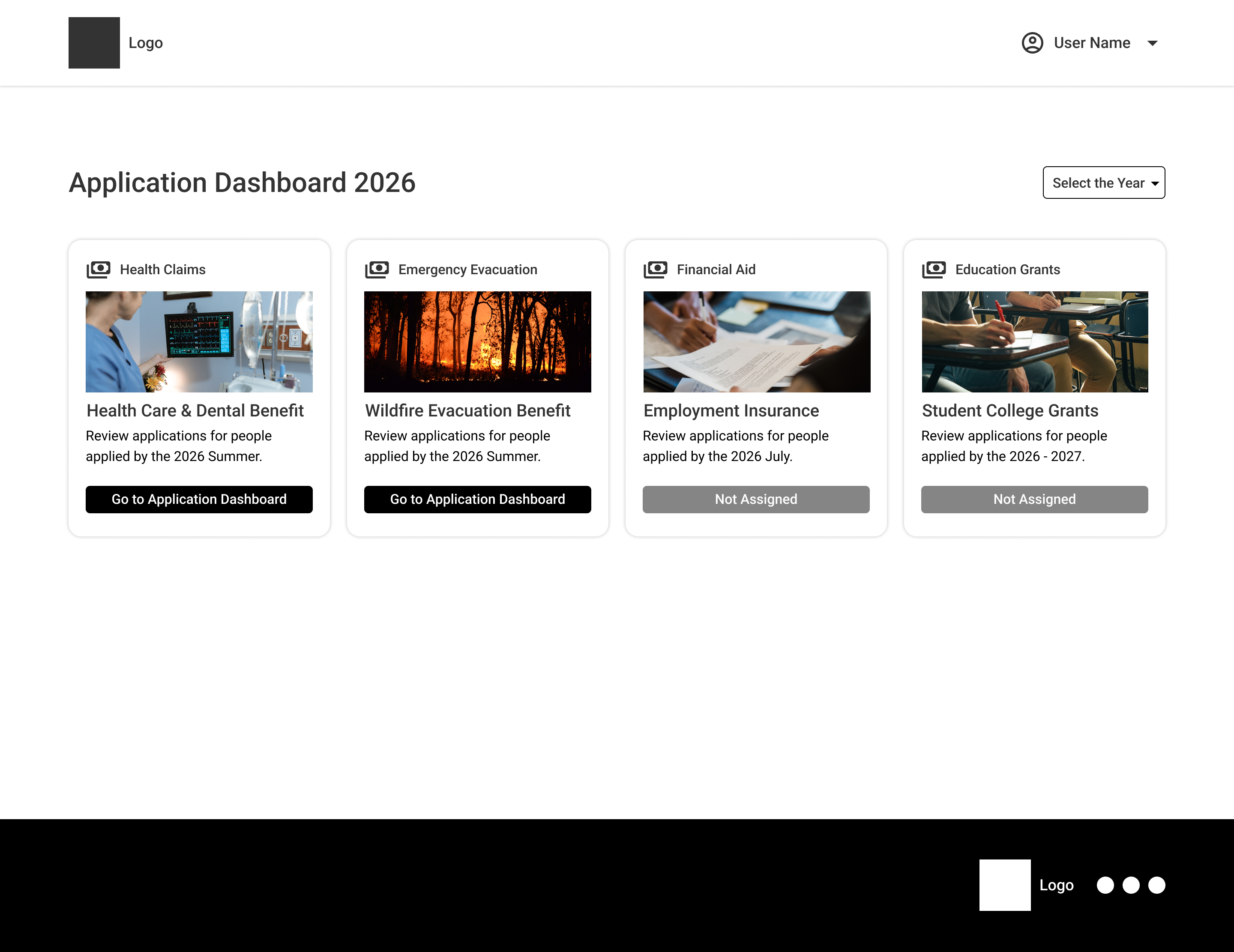
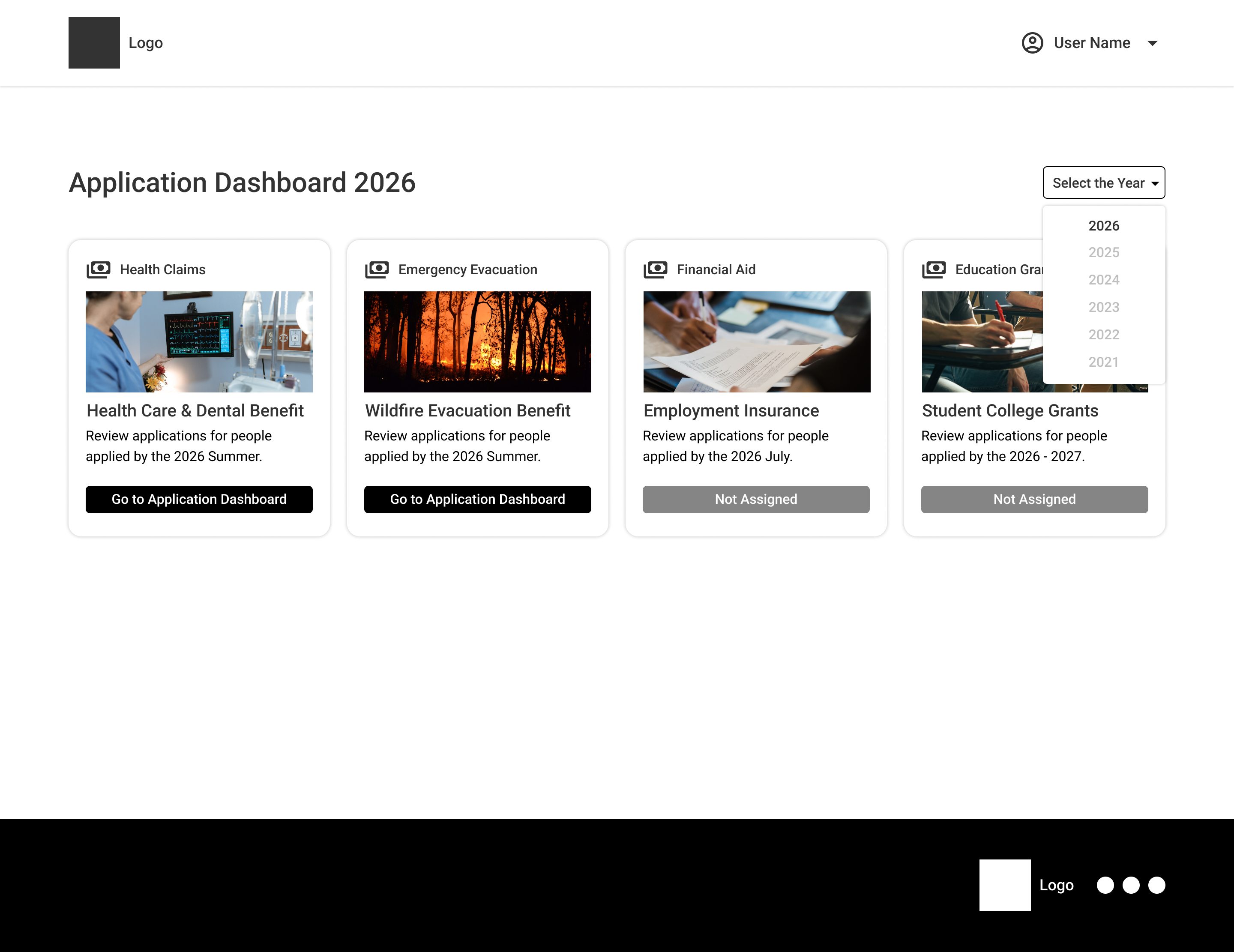
Abstracting the Workspace Card: We created a scalable, standardized card system that combines completely separate ministerial payloads into one layout. When an adjudicator needs to access "Health Care & Dental Benefits" or "Wildfire Evacuation Benefits," the typographic hierarchy, information structure, and interactive features stay consistent.
Time-Bound Workload Routing: Public benefit administration relies heavily on operational cycles, such as spring health intakes or summer evacuation peaks. The platform design clearly displays these time-bound processing blocks, enabling proxy workers to quickly see active regional cycles and track workloads in real time, distinguishing between active assignments and unassigned program queues.
Cross-Program Scalability: If an internal platform is strong enough to handle the fast-paced, high-pressure environment of an active wildfire or flood evacuation filing, its main component library can be easily set up to manage structured, high-volume programs like Health or Education grants.
This pivot successfully transitioned our design team from a reactive, screen-by-screen delivery process to an evidence-based platform strategy, ensuring long-term technical feasibility and structural alignment across multiple public programs.

Stepping into the Design Lead role partway through the project with two other designers meant we needed to stabilize our delivery process during a fast-paced and uncertain production phase. The early stages of the initiative did not have a central place for decisions. As a result, the design team often found itself stuck in an inefficient loop. We designed high-fidelity visual assets based on top-down policy assumptions, but these assets often clashed with the real-world needs of frontline stakeholders during reviews.
To break this cycle, I changed our team’s approach from reactive visual production to an evidence-based alignment model. I guided the team to pause high-fidelity production until we fully mapped out the underlying legislative policies and end-user data requirements. This protected the team from making repetitive revisions and created an organized workspace where our designers could confidently iterate using reliable data.
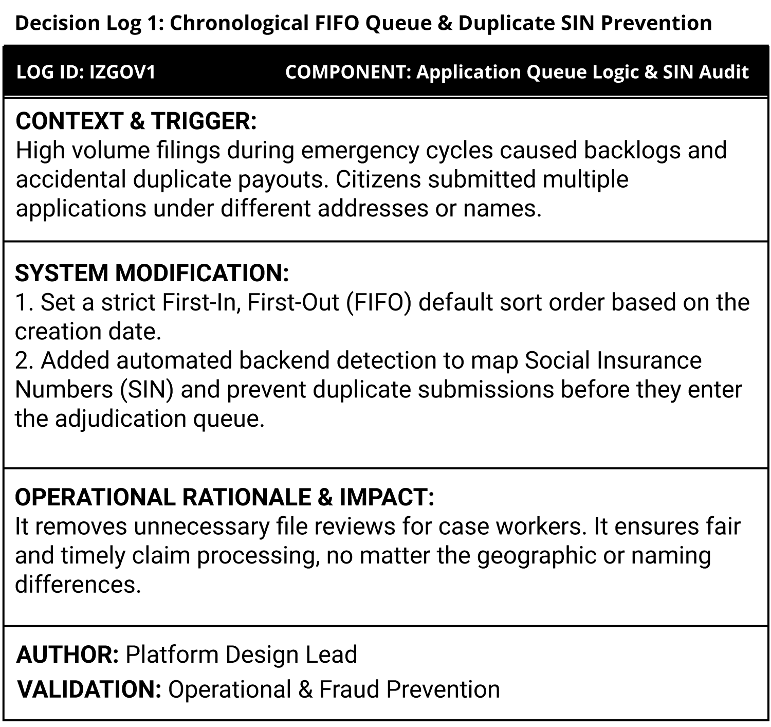
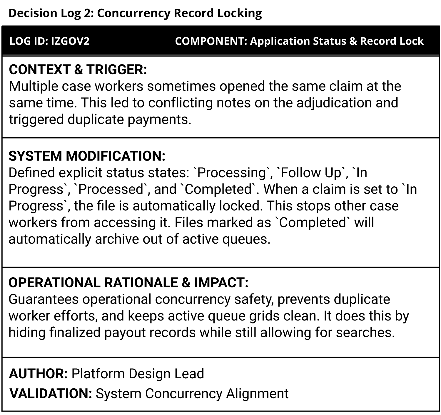
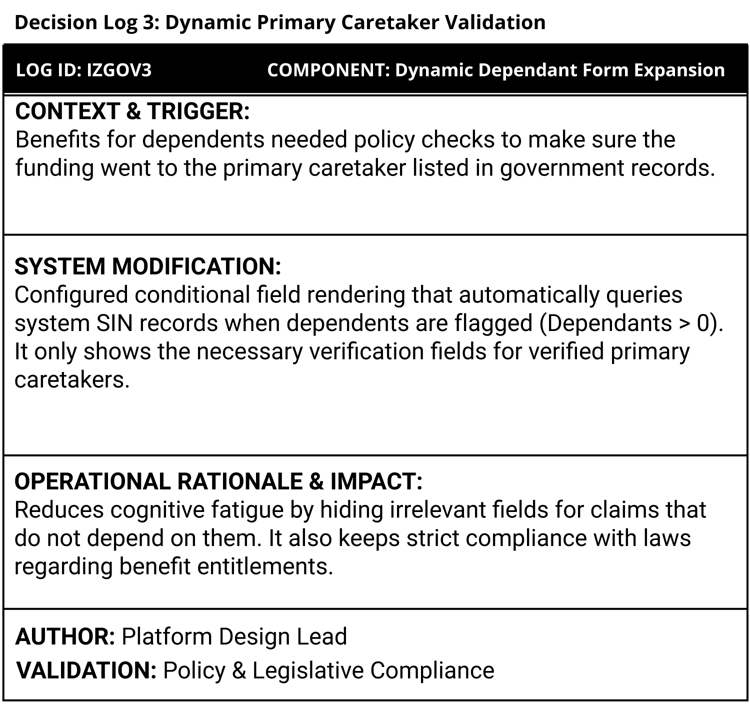
Having faced the difficulty of joining a complicated platform without any documentation or onboarding materials, I set a clear rule for our workspace: if a design choice isn't documented, it doesn't exist.
I created a simple, standardized Design-Decision Log template that is embedded directly in our canvas environment. Each time an interface layout, user status matrix, or interactive component changed due to a policy update or stakeholder review, the designer in charge had to make a brief entry before handing it off for development.
This log tracked:
The System Modification: What layout change or logic adjustment was made.
The Operational Catalyst: The specific policy change, stakeholder insight, or front-end engineering limitation that led to the change.
The Sign-off Audit Trail: The partner or authority who approved the direction, including the execution date.
By setting up this framework, we changed our Figma workspace into a strong, active knowledge base. It protected our design team from random, repetitive feedback and created a clear, trackable history. This way, any new designer or developer could quickly grasp how the system has evolved.
Platform design is only as strong as its execution in production. Creating enterprise tools for adjudicators and proxy workers needs a strong understanding of front-end limits, backend concurrency, and complex state management.
To connect design vision with production deployment, I wrote clear interaction specifications alongside our design system components. Instead of giving static screens, our team supplied engineers with detailed logic models for handling high volumes.
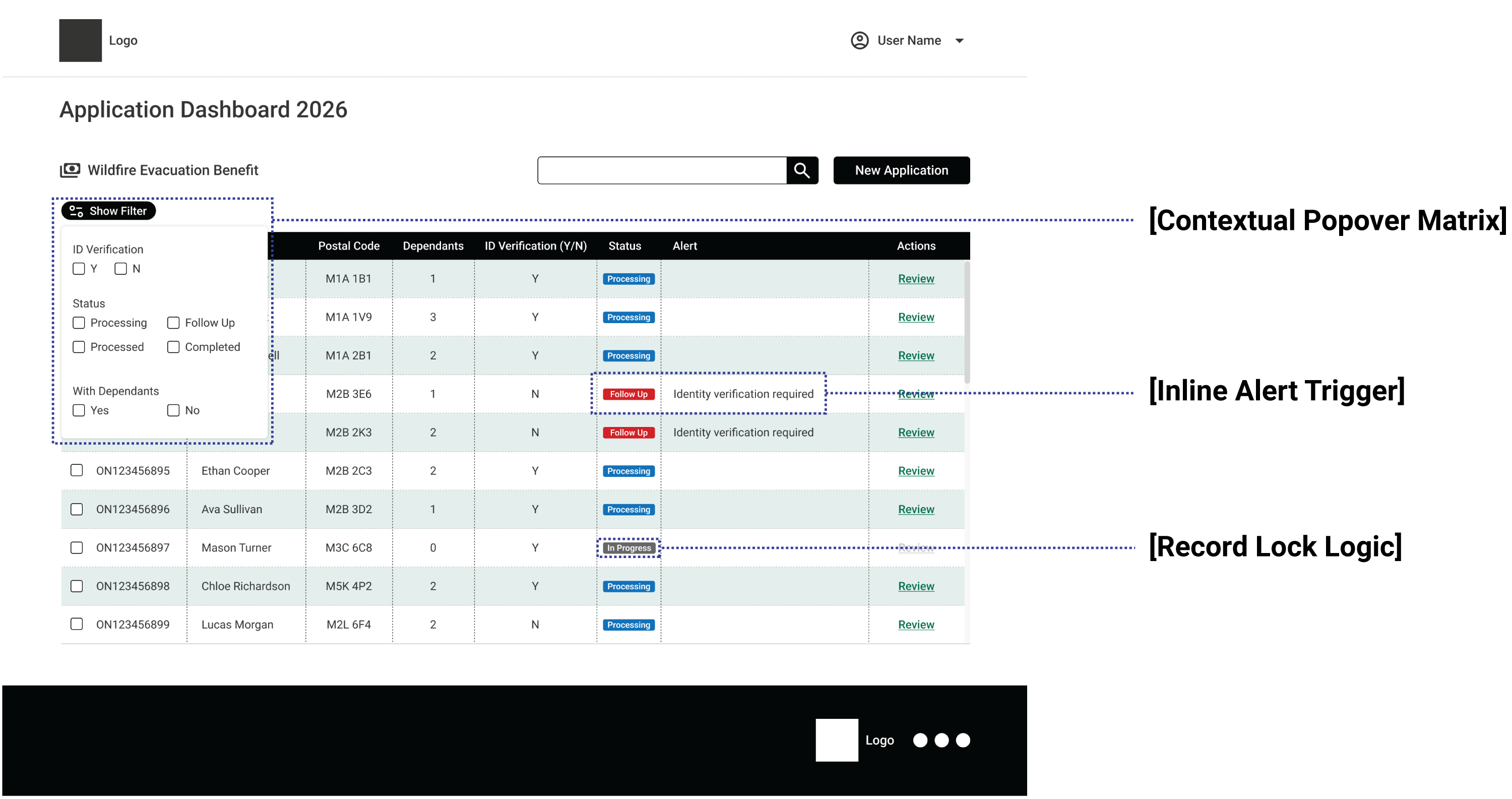
Concurrency and Record Locking: To prevent race conditions where multiple case workers try to process the same claim at the same time, we set up a clear record-locking pattern. When an adjudicator picks a claim, its status changes to In Progress, which automatically locks the file against edits by other workers.
Automated Fraud and Duplicate Mitigation: We created front-end validation routines that connect to backend Social Insurance Number (SIN) registries. If a citizen submits a duplicate claim under a different address or name, the system automatically flags the conflict. This blocks duplicate processing and saves case workers hundreds of hours in manual verification.
Dynamic Data Scoping (FIFO & Archives): To keep active workspace grids responsive, we created a strict First-In, First-Out (FIFO) auto-sort routine based on application date. Finalized claims labeled as Completed automatically move out of active processing queues while still being fully searchable through the global query engine.
To make sure these complex UI patterns could work with the current government legacy systems, I set up regular communication between our design team and the engineering lead.
The Weekly Technical Touchpoint (Tactical Sync) is a weekly, 45-minute meeting with front-end developers. In this session, we review ongoing interactive components, such as progressive disclosure filter popovers, multi-variable checkbox matrices, and dynamic field expansions for primary caretakers. This approach removes the usual issues that arise when engineers have to reject complex designs because of technical limitations.
The Bi-Weekly Sprint Alignment (Strategic Sync): A bi-weekly meeting connected to engineering sprint planning. Here, we handed off complete UI specifications, keyboard focus states, and WCAG 2.1 AA accessibility guidelines. This helped developers create reusable code blocks that matched our platform's design tokens.
By setting these specifications and making sure everything runs smoothly, we significantly cut down on front-end rework, sped up developer onboarding, and guaranteed an easy, reliable deployment phase.
The finalized Universal Public Benefit Infrastructure is a high-density desktop application designed for the needs of public sector adjudicators and proxy workers. By moving away from a single emergency feature and creating a scalable platform, we developed a system that lowers cognitive load, prevents processing errors, and simplifies file management across multiple government streams.
The Universal Landing Portal — Standardized card component architecture displaying active seasonal cycles and worker assignment routing.
Cross-Ministry Consistency: A single entry point where staff can access different program streams. These include time-sensitive Wildfire Evacuation Benefits, structured Health Care and Dental Benefits, Employment Insurance, and Student College Grants.
Workload Routing and Assignment: Each program card clearly shows active intake periods, such as 2026 Spring and 2026 Summer, along with assignment states, like Go to Application Dashboard or Not Assigned. This helps workers focus right away on their regional priorities without getting lost in complicated menus.
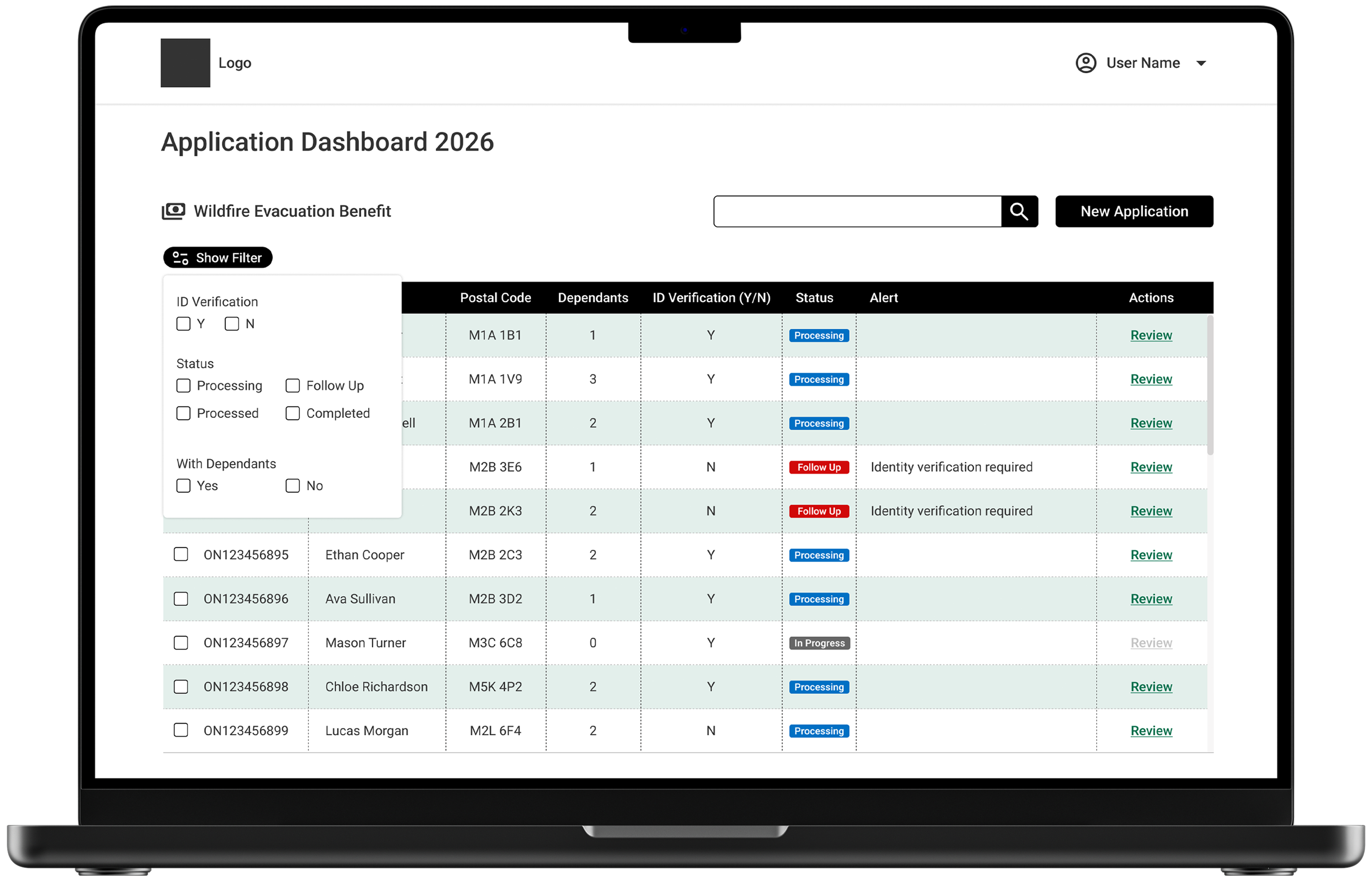
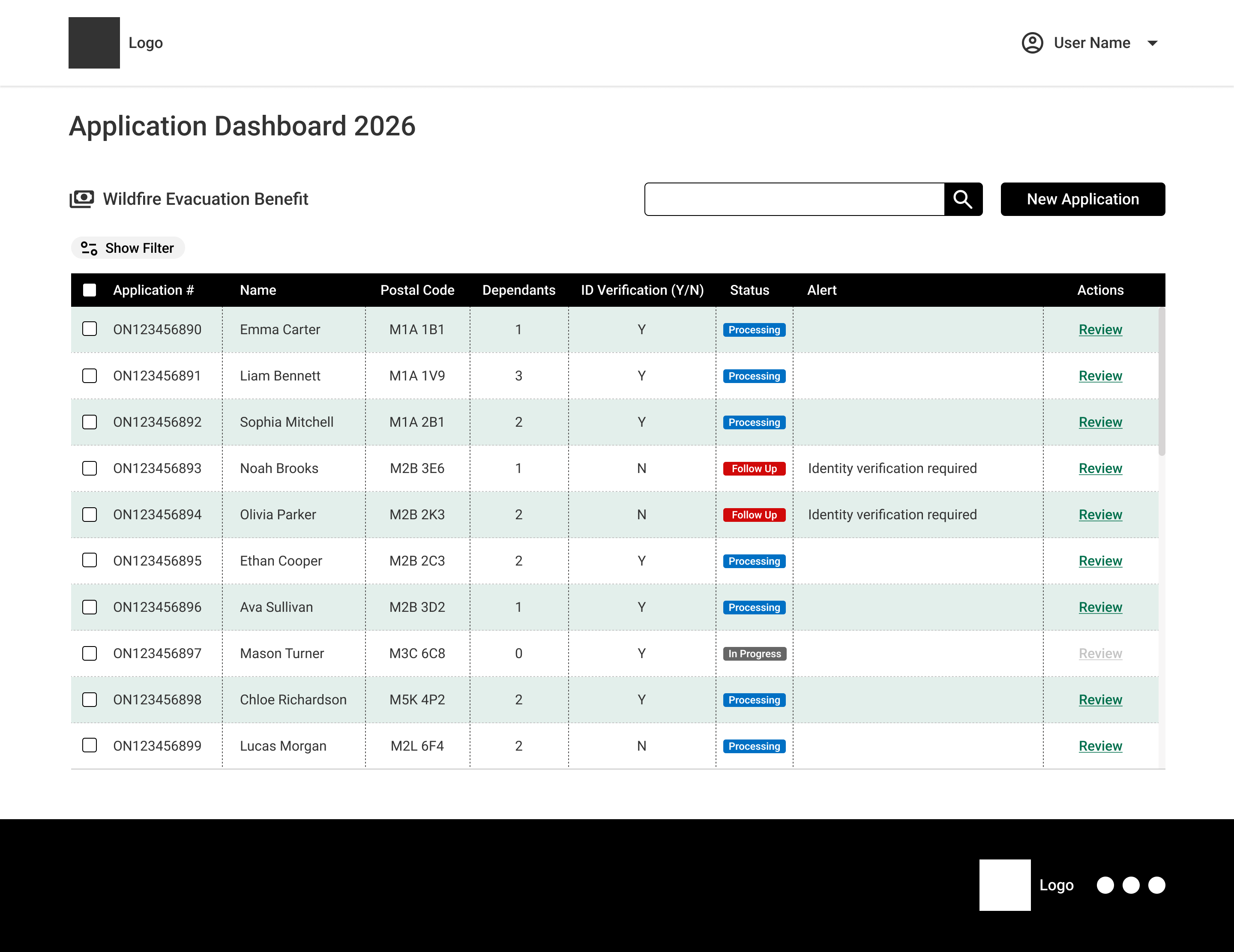
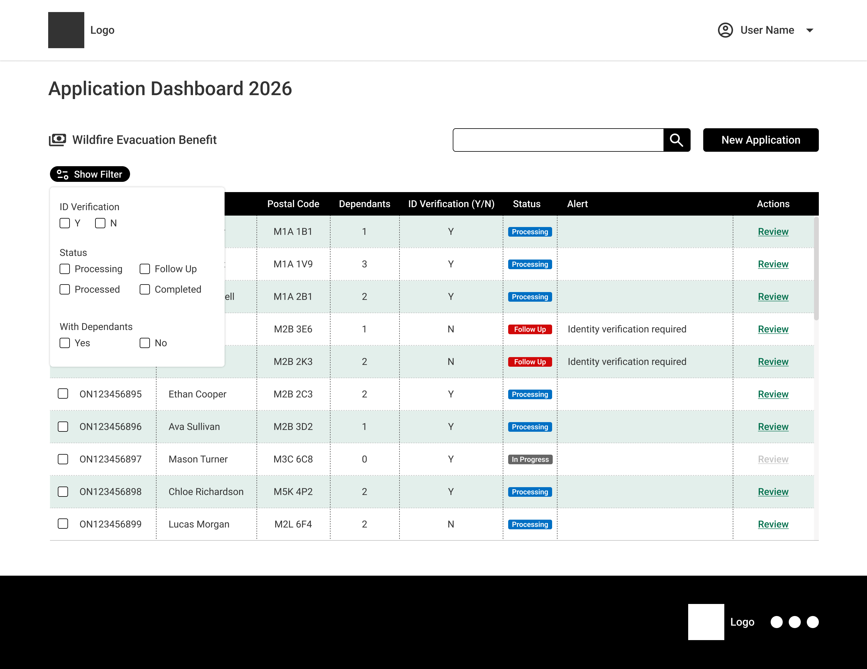
High-Density Processing Engine — Real-time queue management featuring status-driven concurrency locking, inline exception alerts, and contextual filtering.
Structured Data Hierarchy: A high-density grid designed to improve scannability on standard 1080p desktop monitors. Essential claim attributes, including Application Number, Applicant Name, Postal Code, Dependant Count, ID Verification Status, and System Alerts, are horizontally aligned with zebra-striped contrast rows for comfort during long shifts.
Inline Exception Handling: When a file needs manual intervention, such as an unverified Social Insurance Number or missing documentation, the grid shows a red Follow Up badge along with a clear system message stating that identity verification is required. This directs the case worker’s attention right to the processing delays.
Dynamic Progressive Disclosure Filtering: Instead of requiring full-page reloads, an inline popover filter panel (Show Filter) lets users run multi-variable queries locally. It allows for sorting by ID verification status, process state, and dependent flags at the same time, all while keeping the system running smoothly.

Stepping into a lead role in the middle of a project with unclear conditions was a strong lesson in systematic platform design and operational resilience. By turning a chaotic handoff into a data-driven, scalable system, I based my leadership practice on three main principles:
Systemic Scaling Over Feature Isolation:
When facing a crisis, like emergency wildfire or flood relief, it's easy to create quick, localized visual solutions. However, real efficiency comes from taking a step back and identifying universal patterns. By focusing on the main processes of public benefit processing, such as identity validation, queue handling, record locking, and payment logging, we developed a single platform layout engine that can support any future government benefit stream.
Documentation is the Shield of the Design Team.
In public sector organizations, legislative policies and leadership structures change quickly. When design decisions are not documented, it results in confusion and misalignment. The Design-Decision Log helped protect the team from random feedback. It provided a clear reason for each UI iteration, whether based on operational agreement or WCAG compliance. This log created a lasting memory for engineers and new designers.
Bridge the Technical Gap Early:
Designing high-density enterprise tools means treating developers as key partners, not just end users. We set up weekly technical meetings to make sure our front-end component specifications, such as concurrency record locking, automated duplicate SIN detection, and keyboard accessibility, were practical, efficient, and prepared for production handoff.
By shifting from a single wireframe to a Universal Public Benefit Infrastructure, our team achieved:
Operational Continuity. We stabilized team performance after an unexpected leadership change by setting up clear decision-tracking systems.
Reduced Time-to-Deployment. Reusable design tokens and layout schemas let new ministerial programs, such as Health, Education, and EI, launch on existing back-office systems without creating custom admin tools from scratch.
Improved Adjudication Efficiency. We developed a user-friendly, accessible interface that removes concurrency issues, instantly highlights high-priority alerts, and reduces cognitive strain for proxy workers on long shifts.