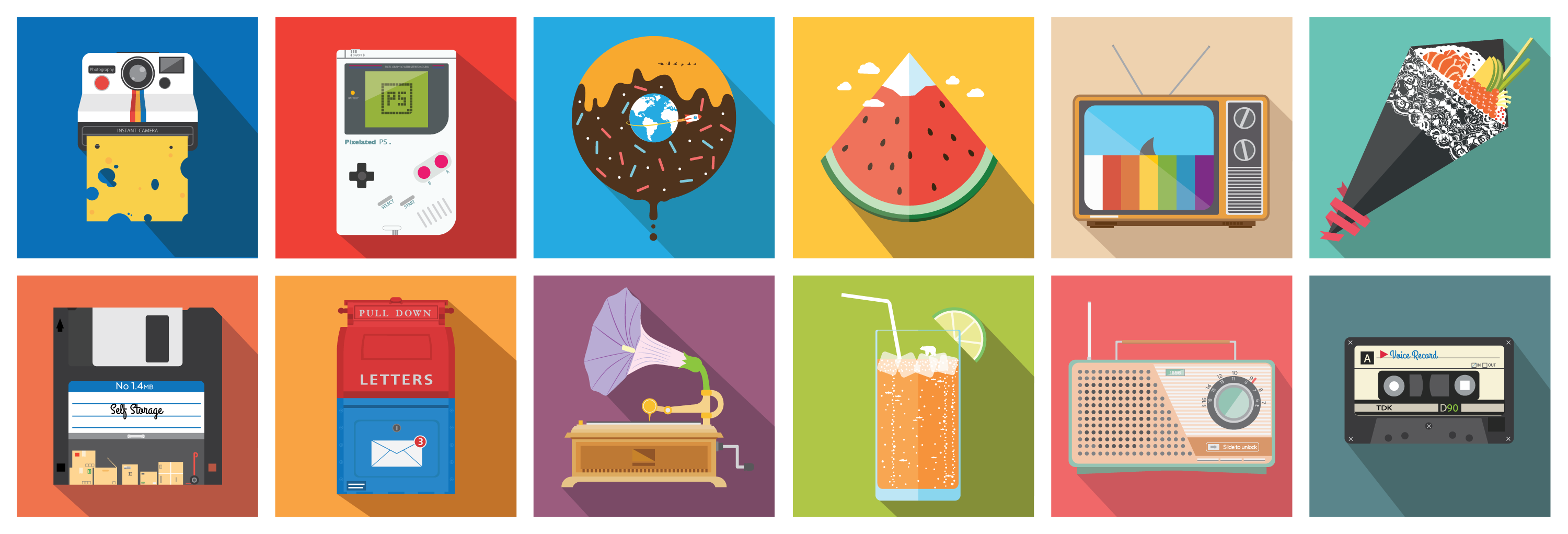
Past the functional aspects of product interfaces is the area of conceptual art direction, motion, and visual metaphor. This project brings together editorial illustrations that have won awards as recognised by Creative Quarterly and includes original explorations of typographic characters. It shows how bold conceptual thinking, together with vector precision and micro-animation, can raise the standard of editorial media, brand campaigns, and visual storytelling.

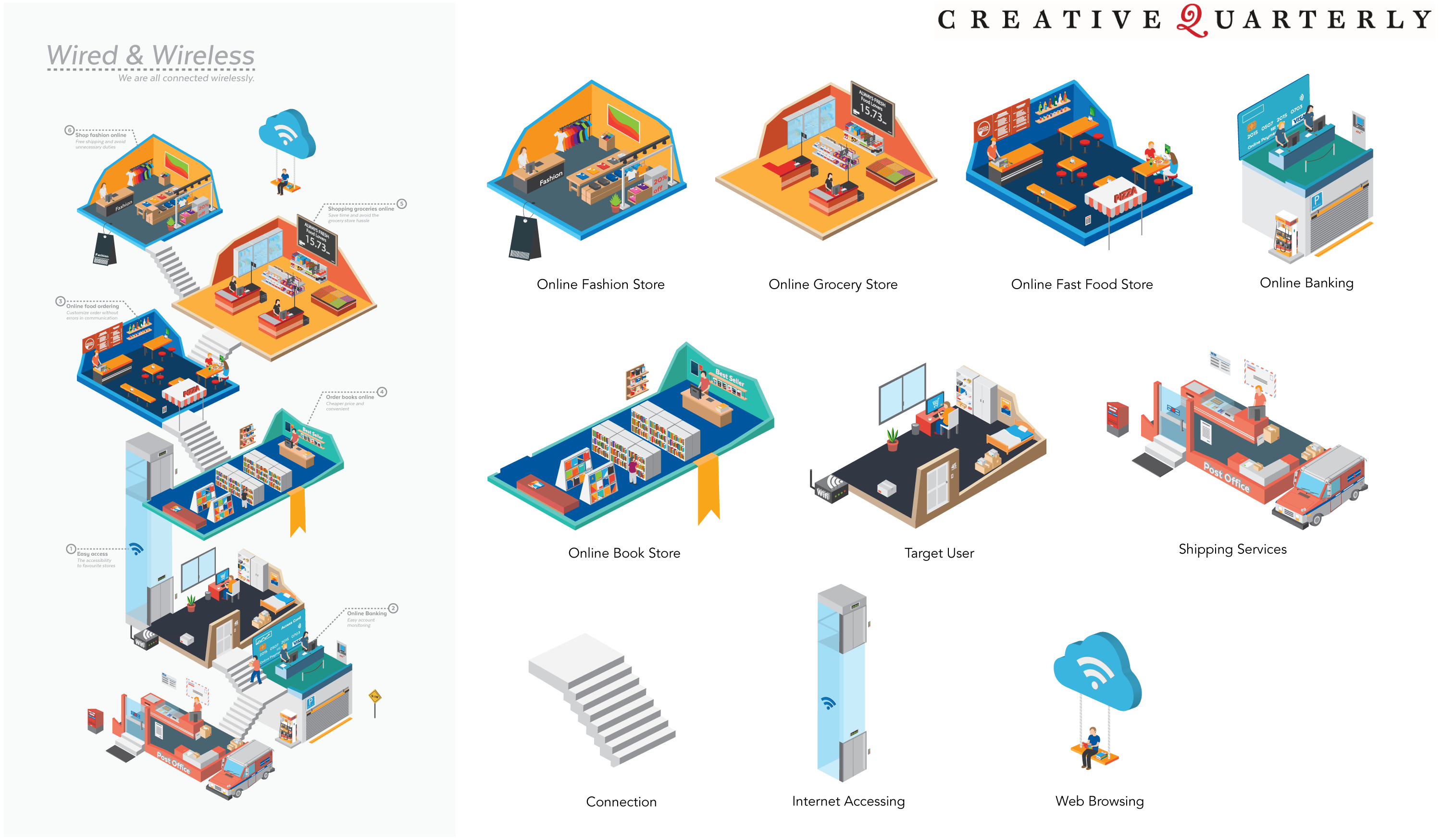
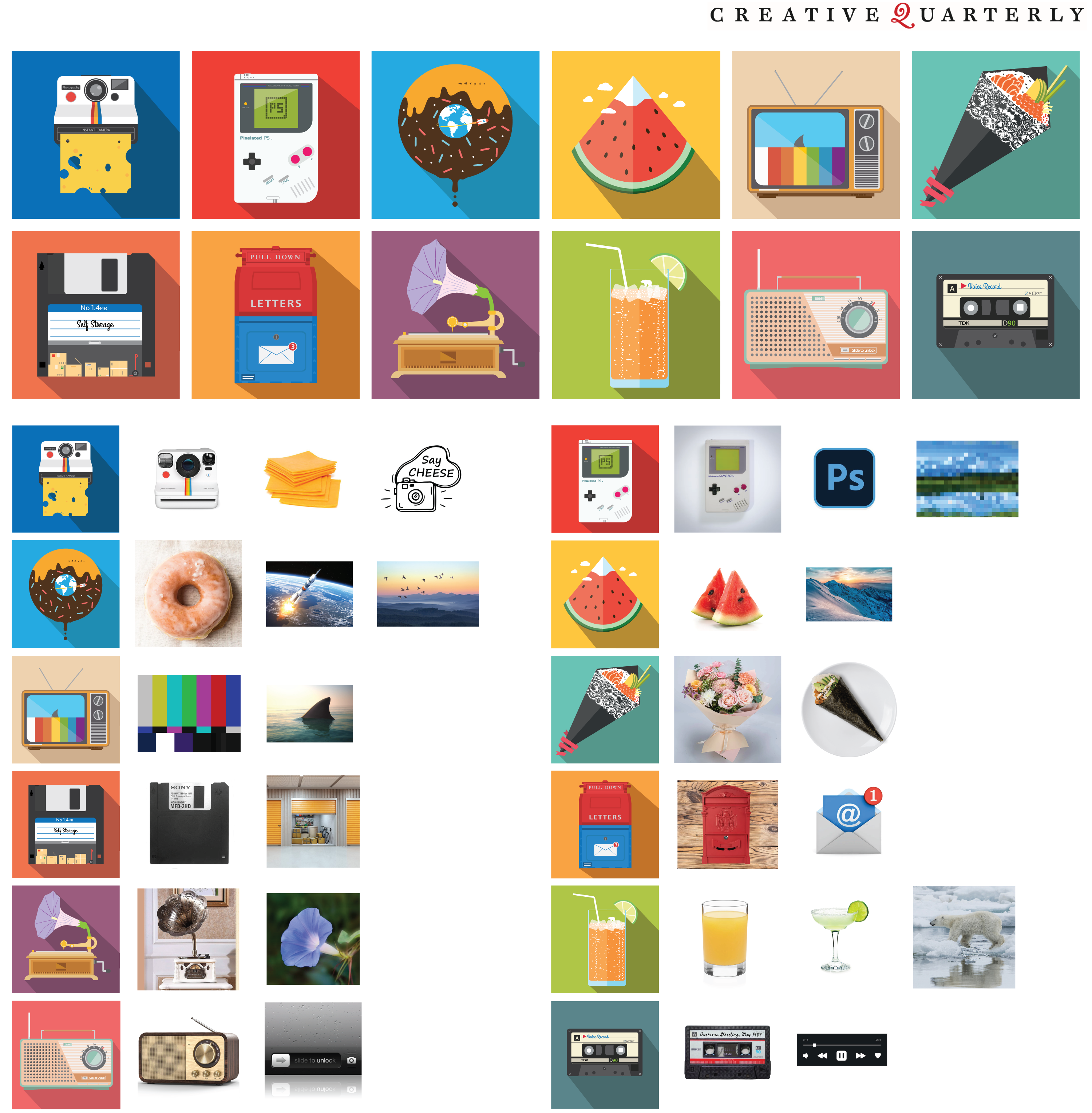
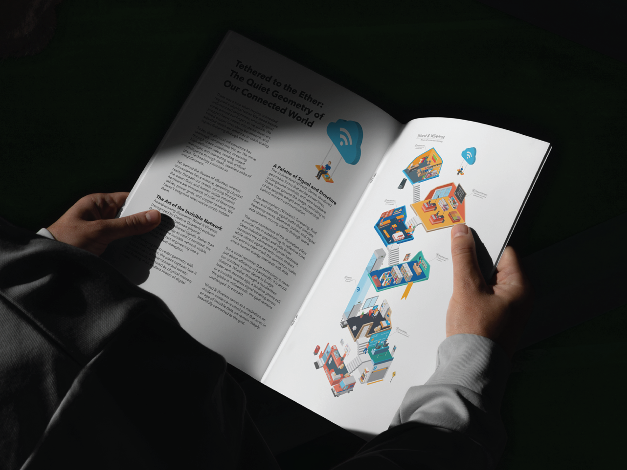
A good editorial illustration converts complicated human experiences into simple and impressive visual metaphors. The illustrations have been acknowledged by Creative Quarterly (as the winner in CQ 39 and as a runner-up in CQ 41), and they examine the subtle connections and irony of our digital lives.
Wired & Wireless: A conceptual investigation into the invisible data networks that surround us, explaining the way devices transmit and receive signals in a quiet, global pattern.
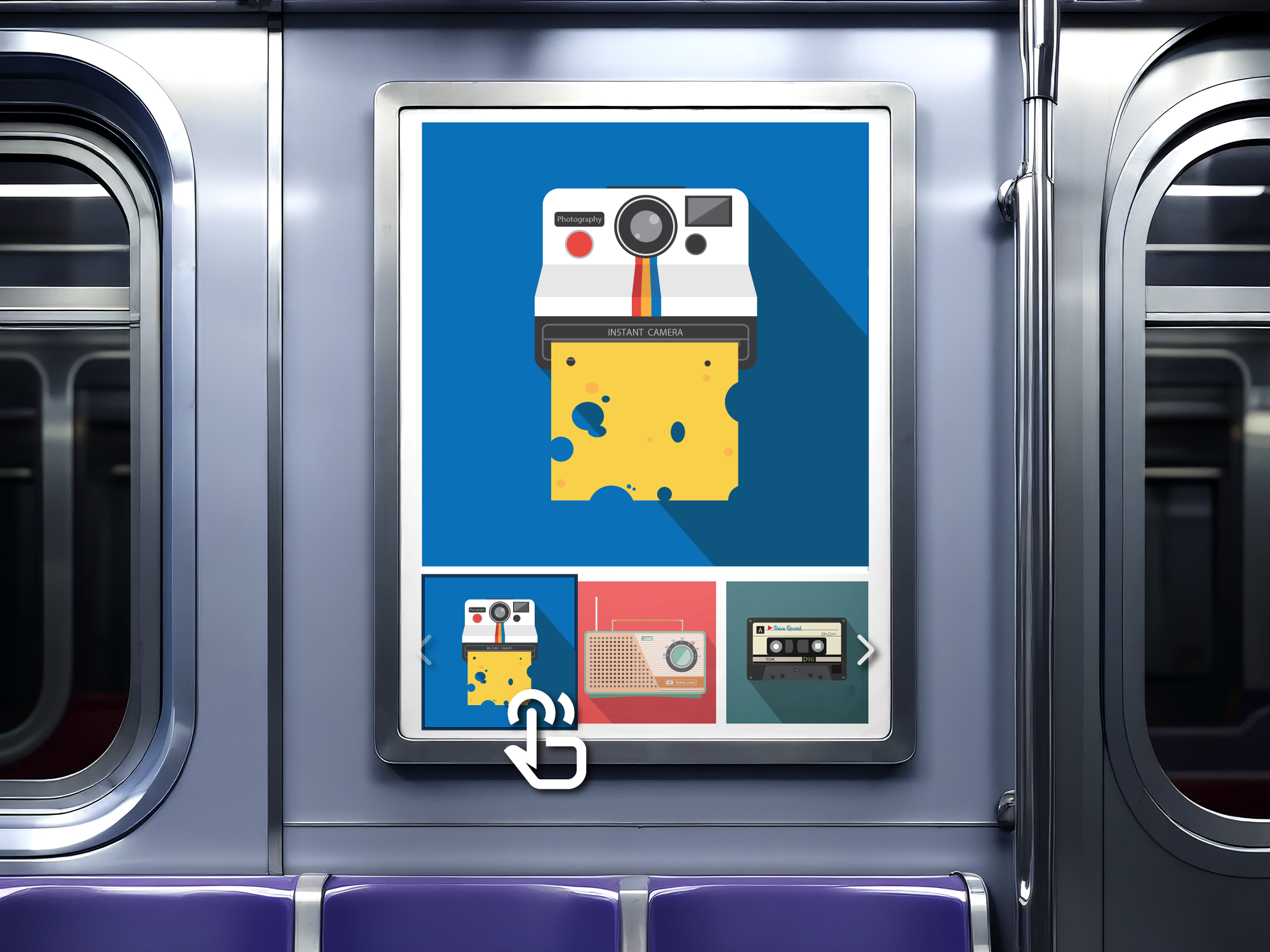
Object-Matter: A visual series that arises from observing everyday micro-moments, reinterpreting ordinary objects (such as instant cameras and radio sets, as well as morning glories) as clever and surreal stories through the use of simple vector styles and strong colour blocking.

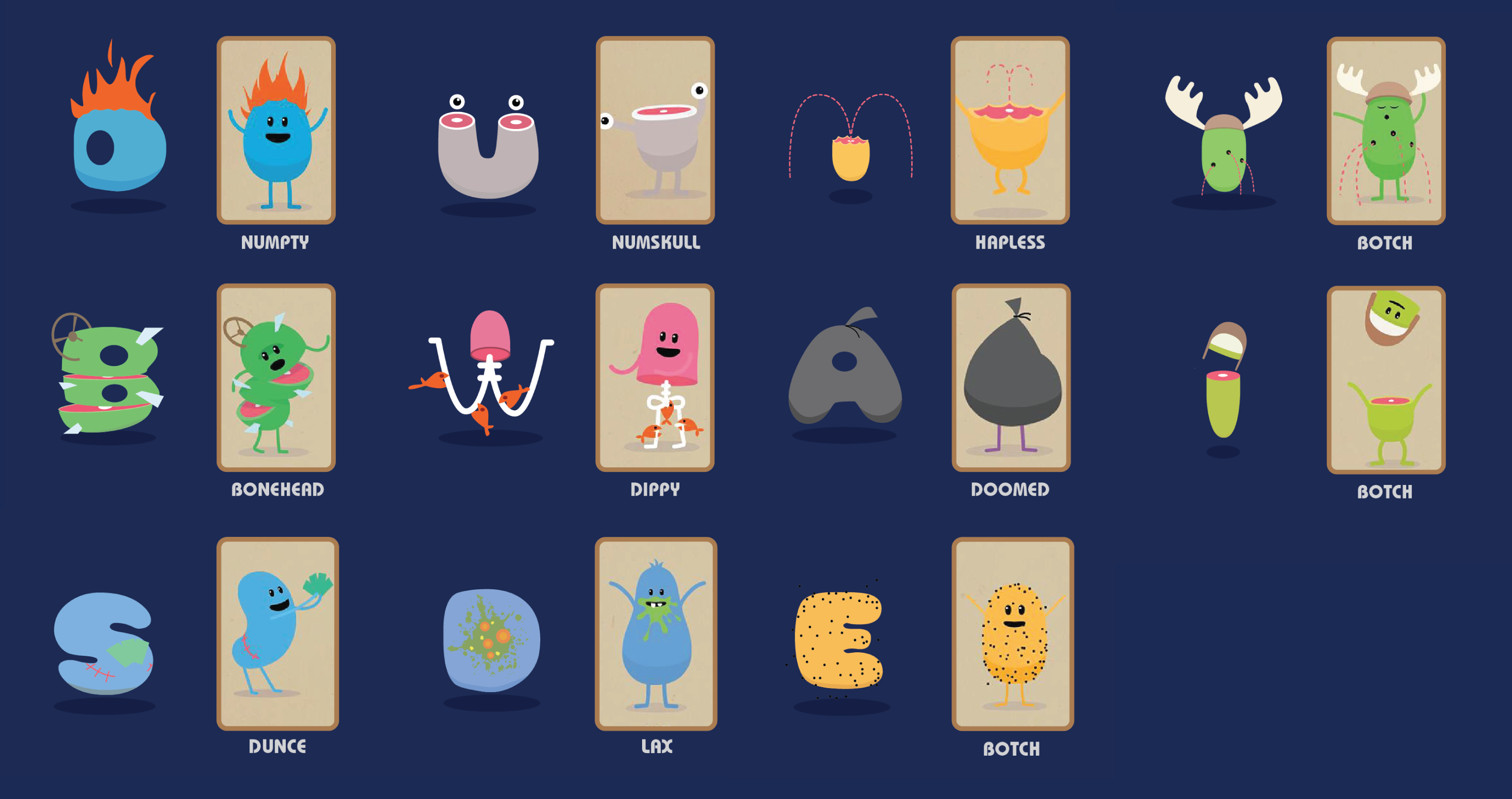
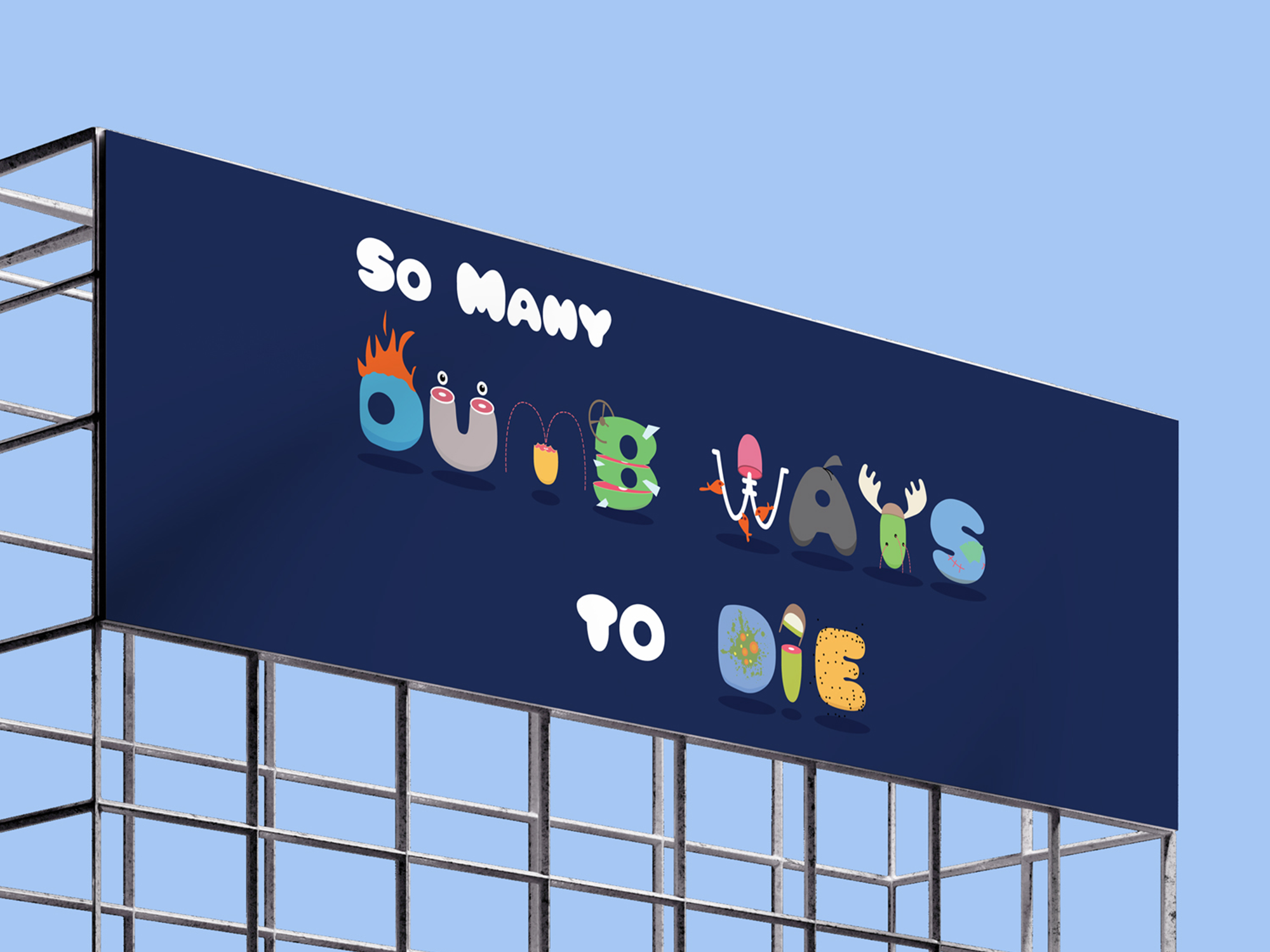
The Dumb Type typeface is an experimental display typeface which combines character design with typographic structure, being inspired by the viral 'Dumb Ways to Die' campaign.
Analyzing character traits: Each letterform was carefully designed to reflect the particular traits, colours, and shapes of the individual animated characters while at the same time ensuring that it remained legible as a display font.
Motion Integration: Going beyond the creation of static fonts, micro-animations were developed in order to give each character personality, demonstrating the way in which custom typography combined with motion design can add charm and pleasure to digital brand campaigns.
Visual storytelling is at its best when it is smoothly used across all commercial contact points, and this session shows the way in which individual illustrations and custom typefaces adapt to different media environments:
For editorial and publishing purposes, high-impact cover art and editorial headers are used to increase engagement in both digital and print publications.
Out-of-home (OOH) campaigns refer to large-scale displays such as billboards which are intended to convey a brand's narrative within a few seconds.
Interactive Digital Media: This involves using motion graphic and vector assets to produce memorable promotional campaigns and digital splash screens.